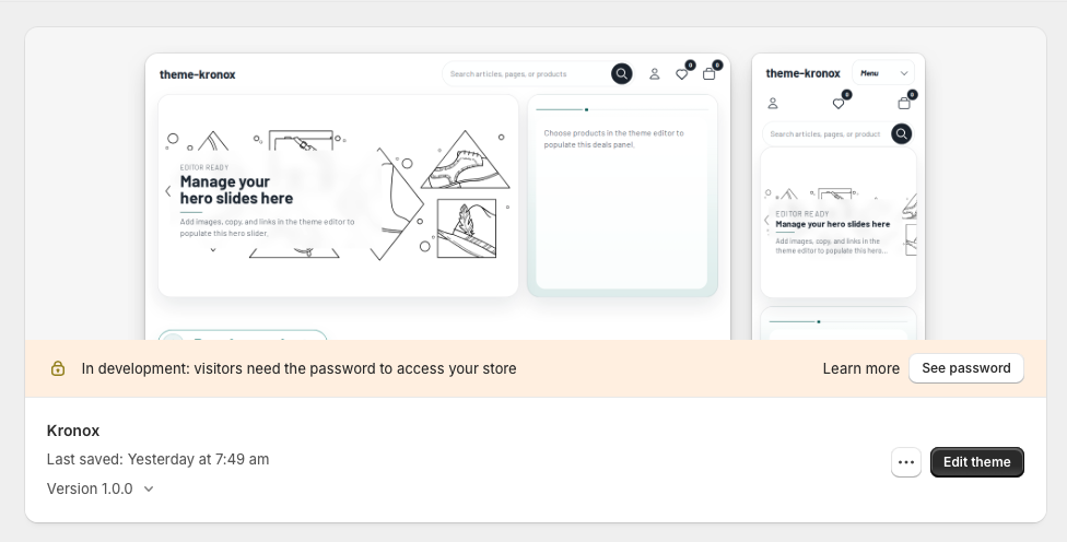
Kronox is a flexible Shopify Online Store 2.0 theme. This documentation helps merchants install the
theme, configure common storefront experiences, understand support coverage, and contact support with the
right details.
Kronox is designed to be managed through the Shopify theme editor. Before publishing, duplicate the theme
and test your changes on the unpublished copy.
In Shopify admin, open Online Store.
Upload the Kronox theme or add it to your store from the Theme Store.
Open the theme editor with Edit Theme.
Adjust the logo, colors, typography, header, footer, and page templates for your store.
Test the mobile layout, cart flow, product variants, and search results.
Theme editor
Theme settings are designed around merchant workflows. Global branding, colors, typography, layout widths,
header behavior, and footer content can be updated from the theme editor.
Open Online Store > Themes, find Kronox, then select Edit theme to
customize the theme.
Global settings
The logo, color system, type scale, and spacing rules apply across the full storefront experience.
Sections and blocks
Homepage, product, collection, blog, and static page content is managed with drag-and-drop sections and blocks.
Dynamic sources
Metafields and Shopify dynamic sources are supported; avoid hardcoded products or collections.
Global configuration
General theme settings
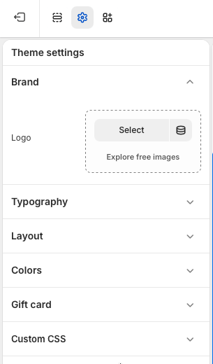
Use the gear icon in the Shopify theme editor to open Theme settings. These settings control
storefront-wide defaults, so changes made here can affect multiple templates and sections at once. Individual
sections may still offer their own settings when a more specific override is needed.
Brand
Add the store logo from Theme settings > Brand. Select an uploaded image or choose
an image from Shopify's free image library. The logo is used in global brand areas such as the header
and other theme surfaces that reference the store identity.
Typography
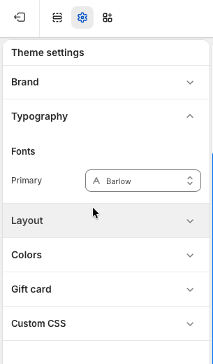
Set the primary storefront font from Theme settings > Typography. This font is the
default typeface for the theme and helps keep headings, body text, buttons, and form controls visually
consistent across the store.
Layout
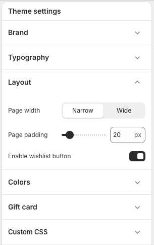
Adjust storefront spacing from Theme settings > Layout. Choose a narrow or wide
page width, set the page padding in pixels, and enable or disable the wishlist button. Use a wider
layout for image-rich stores or large catalogs, and use narrower spacing when readability is the main
priority.
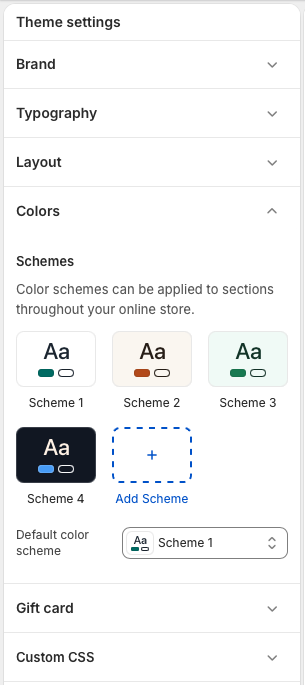
Colors
Manage the theme color system from Theme settings > Colors. Edit existing color
schemes, add new schemes, and choose the default color scheme for the store. Color schemes can be
applied to sections throughout the theme, making it easier to create contrast between promotional,
editorial, and product-focused areas without rebuilding section layouts.
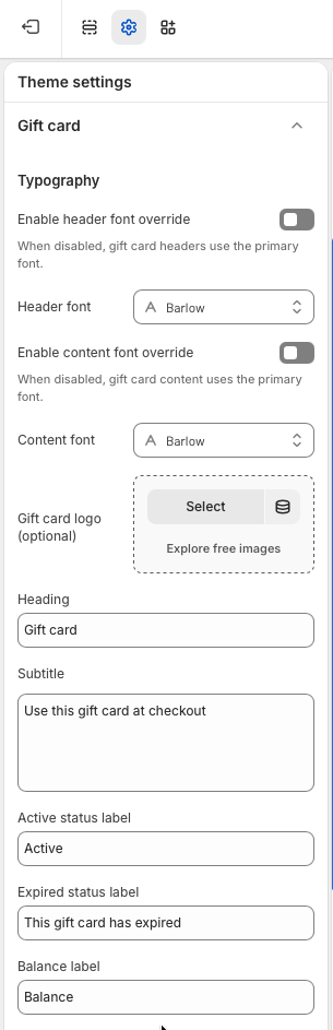
Gift card
Customize the gift card experience from Theme settings > Gift card. You can keep the
global primary font or enable separate header and content font overrides, add an optional gift card
logo, and edit the heading, subtitle, status labels, balance label, and other customer-facing text.
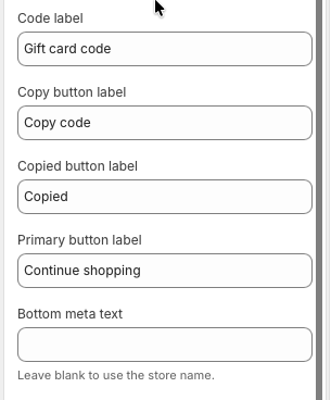
Gift card labels
The lower gift card settings control the gift card code label, copy button text, copied confirmation,
primary button label, and bottom meta text. Leave the bottom meta text blank if the gift card should
automatically use the store name.
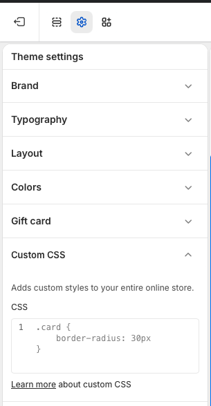
Custom CSS
Add small global style adjustments from Theme settings > Custom CSS. Custom CSS is
applied to the entire online store, so keep changes focused and test key pages after editing. For
larger design changes, update the theme settings or relevant section settings first whenever possible.
Recommended workflow
Start with Brand, Typography, Colors, and Layout to establish the global storefront foundation.
Review the homepage, product page, collection page, cart, and gift card page after changing global settings.
Use section-level settings for page-specific design changes, and reserve Custom CSS for small refinements.
Header
The header controls the storefront logo, navigation, account and cart icons, localization selector, wishlist
button, and predictive search field.
Open the Header section from the theme editor sidebar to manage the storefront header.
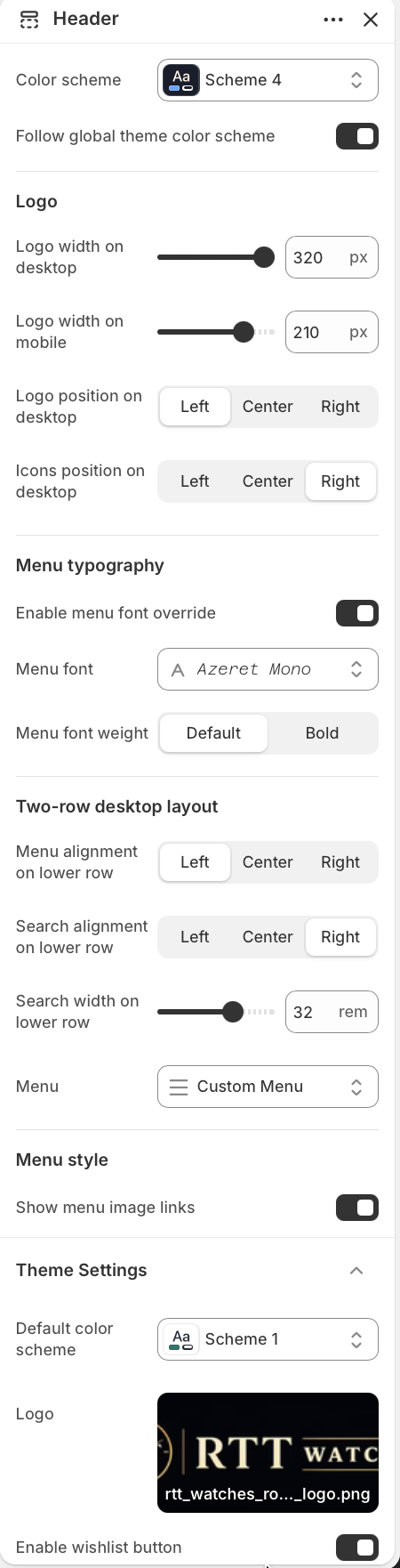
Header settings
Color scheme
Choose the color scheme used by the header area.
Use Color scheme when the header needs its own palette. Keep Follow global
theme color scheme enabled to use the default theme colors instead.
Logo
Control logo size and desktop placement.
Adjust Logo width on desktop and Logo width on mobile to fit the
uploaded brand mark. Use Logo position on desktop and Icons position on
desktop to place the brand and utility icons on the top row.
Menu typography
Control the navigation font and weight.
Turn on Enable menu font override only when the navigation should use a different
font from the rest of the theme. Select Menu font and use Menu font
weight to switch between default and bold labels.
Two-row desktop layout
Set the lower row alignment for menu and search.
Menu alignment on lower row and Search alignment on lower row
support left, center, or right alignment. Use Search width on lower row to balance
search visibility with available navigation space.
Menu
Select the Shopify menu shown in the header.
Choose the navigation menu from Menu. Keep menu labels short so the two-row header
stays readable on desktop and collapses cleanly on smaller screens.
Menu style
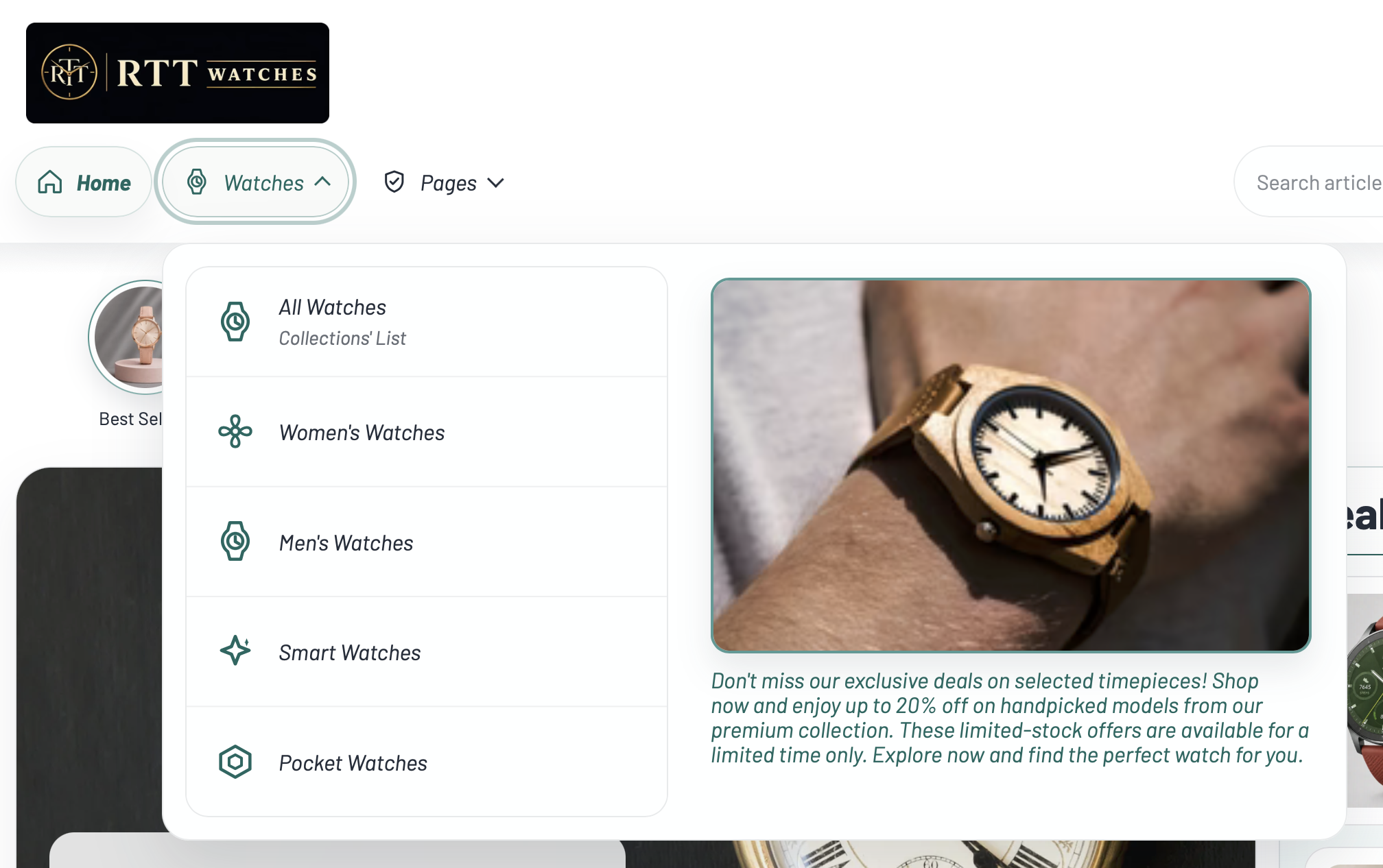
Enable optional image links in dropdown menus.
Turn on Show menu image links to display matching Menu image link
blocks beside dropdown menu items. This works best for visual category shortcuts or featured links.
Menu item icon block
Add an icon to a top-level or submenu item.
Add a Menu item icon block, enter the exact Menu item title, then
choose an Icon or upload a Custom icon image. Custom images override
the selected icon.
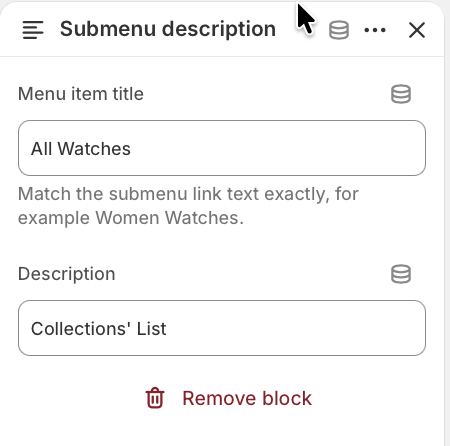
Submenu description block
Add helper text under submenu links.
Add a Submenu description block, match the submenu label in Menu item
title, then add the short Description shown below that submenu item.
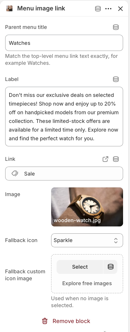
Menu image link block
Add visual links beside a parent dropdown.
Add a Menu image link block and match the top-level dropdown label in Parent
menu title. Set the Label, Link, and Image.
If no image is selected, the fallback icon or fallback custom icon image is used.
Menu item icon blocks add visual cues beside matching top-level and submenu labels.
Submenu description blocks show short helper text below matching submenu links.
Menu image link blocks add visual shortcuts beside the selected parent dropdown.
Theme settings
Adjust global header-related defaults used by the theme.
Use Default color scheme to choose the fallback scheme used across the theme when a
section follows global theme colors. Upload or select a Logo for the storefront brand
mark, and use Enable wishlist button to show or hide wishlist actions.
Best practices
Preview both desktop and mobile after changing logo width, lower row alignment, search width, or menu typography.
Match menu titles exactly when using icon, description, or image link blocks.
Footer
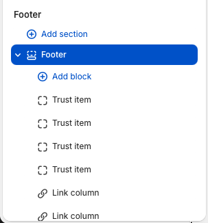
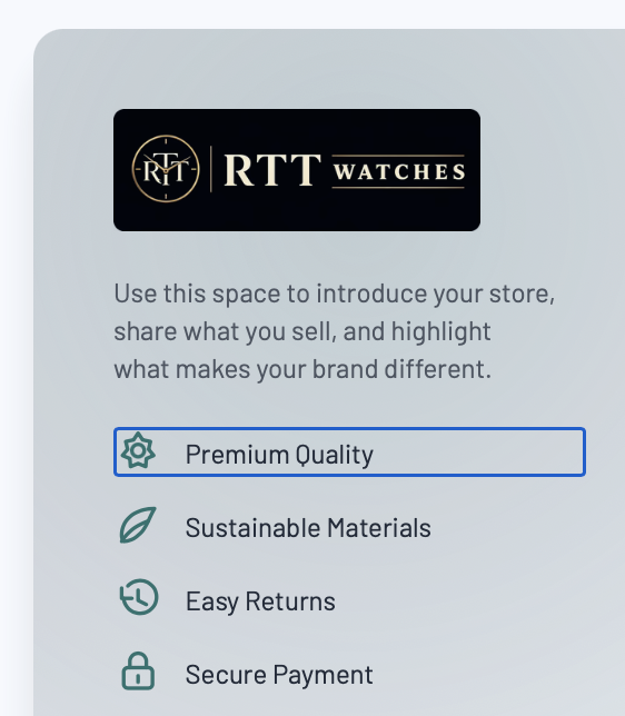
The footer controls the storefront brand summary, trust items, navigation columns, newsletter signup,
contact details, social links, and bottom bar. Configure it from
Online Store > Themes > Customize > Footer.
Open the Footer section from the theme editor sidebar to manage footer content and blocks.
Footer settings
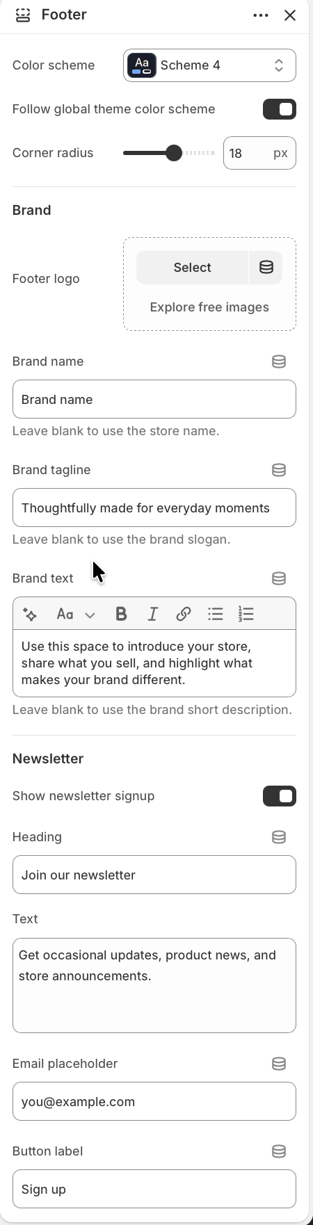
Style
Set the footer color treatment and container shape.
Choose a Color scheme, or enable Follow global theme color scheme
to use the theme-wide default. Use Corner radius to soften or square off the footer
panel.
Brand
Control the logo, name, tagline, and intro text.
Upload a Footer logo when the footer should use a different mark from the global
logo. Set Brand name, Brand tagline, and Brand text
for the footer intro. Blank fields fall back to store name, brand slogan, or brand short description
when those values are available.
Newsletter
Show a customer signup panel in the footer.
Enable Show newsletter signup, then edit the heading, body text, email placeholder,
button label, and rich text disclaimer. The form uses Shopify's customer newsletter form and shows
success or error messages after submission.
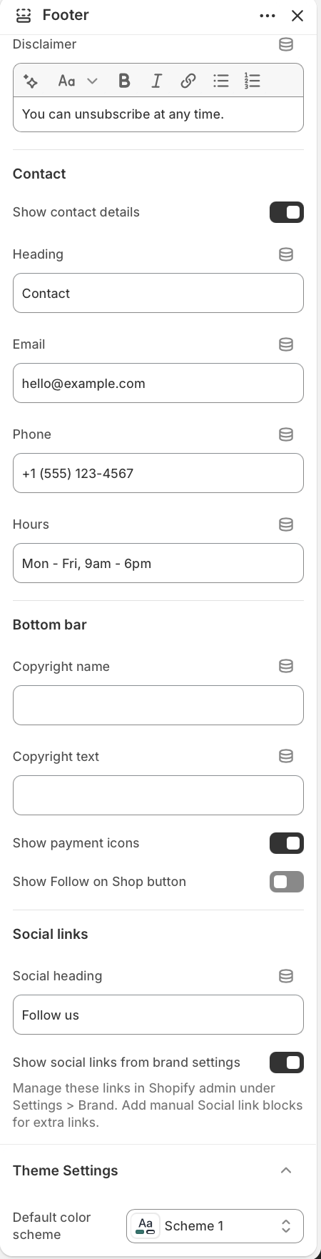
Contact
Add store support details beside the newsletter panel.
Enable Show contact details to display the contact panel. Merchants can set the
heading, email, phone, and service hours. Leave individual fields blank when they should not appear.
Footer menus
Add navigation through Link column blocks.
Footer navigation is managed with Link column blocks rather than section-level menu
settings. Add one block for each column, then select the Shopify menu that should appear in it.
Bottom bar
Configure copyright, payment icons, and Shop follow.
Set a custom Copyright name and Copyright text, then choose whether
to show payment icons and the Follow on Shop button.
Social links
Use brand social accounts or manual social blocks.
Edit the Social heading and keep Show social links from brand settings
enabled to automatically show the social accounts added in Shopify admin under
Settings > Brand. Add manual Social link blocks here only when the footer needs
extra platform links or custom URLs.
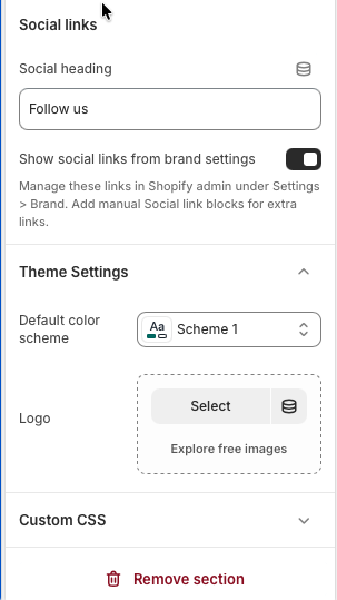
Theme settings
Control the global fallback values used by the footer.
Default color scheme is used when the footer follows global theme colors. The global
Logo can also be used by the footer when no footer-specific logo is selected.
Custom CSS
Add targeted styling only when necessary.
Use Custom CSS for small, section-specific adjustments. Keep changes scoped so they
do not affect other theme sections.
Footer blocks
Footer blocks are drag-and-drop content items. The footer supports up to 16 blocks total, with trust items
limited to 4 so the footer stays compact on mobile and desktop.
Link column
Create reusable footer navigation columns.
Add a Link column block, enter a heading, and select a Shopify menu. If the heading is
blank, the selected menu title can be used as the column heading. Link columns appear as desktop
columns and mobile accordion rows.
Trust item
Highlight short reassurance messages.
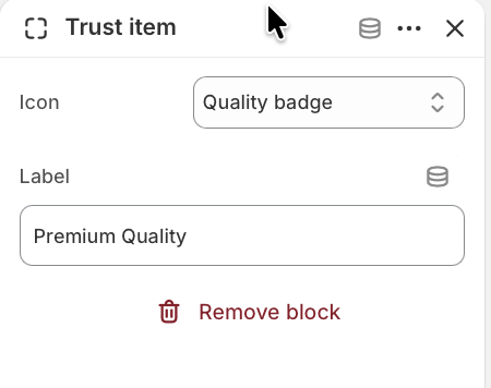
Add up to four Trust item blocks. Choose an icon such as Quality badge, Leaf, Return,
or Lock, then write a short Label like "Easy returns" or "Secure payments".
Trust item settings
Edit each trust item block individually.
The block settings include Icon and Label. Keep the label short so
the feature list remains easy to scan beside the footer brand text.
Social link
Add manual links in addition to the Shopify brand social accounts.
Shopify brand social accounts are pulled into the footer automatically when enabled. Use this block
to add extra manual links by choosing the platform, writing an accessible label, and adding the URL.
Supported platforms include Instagram, Facebook, X, LinkedIn, Pinterest, Snapchat, TikTok, Tumblr,
Vimeo, and YouTube. If the block link is blank, the matching brand setting can be used when available.
Best practices
Keep link column headings short and assign real Shopify menus before publishing.
Use concise trust item labels so the row remains readable on smaller screens.
Preview the footer on mobile after changing newsletter, contact, or social link settings.
Use brand settings for shared social links, and manual Social link blocks only when extra links are needed.
Homepage
The homepage is built entirely with sections. Merchants can add and reorder hero banners, featured products,
featured collections, rich text, image with text, newsletter, and promotional banner sections.
Homepage section
Home collection links
The Home collection links section creates a horizontal set of visual collection shortcuts near the top of
the homepage. Use it to help customers move quickly into important categories, seasonal edits, brand
campaigns, or any collection that should be easy to discover before they scroll deeper into the page.
Make sure you are editing the active Kronox theme and that the page selector is set to Home page before
changing homepage sections.
Open the Home page template
Open the Shopify theme editor and choose Home page from the page selector. In the Template
area, add or select Home collection links. The section can be reordered with the other
homepage sections, so place it where category discovery makes the most sense for the store.
Home collection links settings
Template position
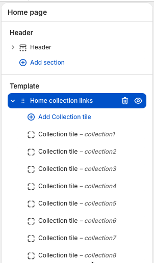
The section lives in the homepage Template area, below the header and above the footer. Add one
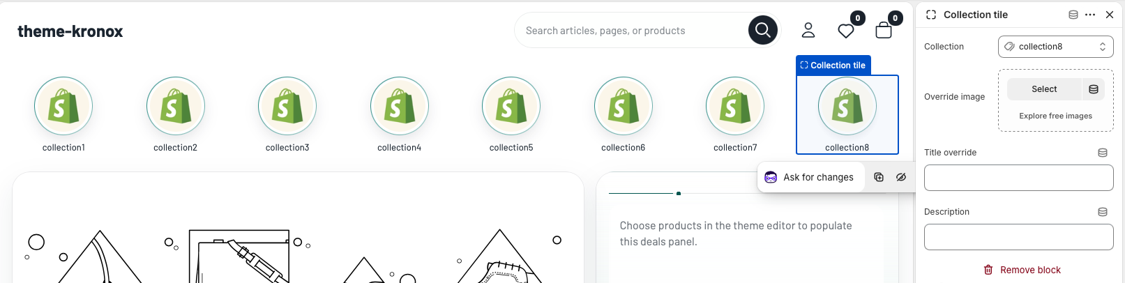
block for each collection link you want to show. The screenshot shows multiple
Collection tile blocks under the section, and the number of tiles can be changed
by adding, removing, or reordering blocks.
Use blocks for links
Select Add Collection tile to add another shortcut. Each block controls one
collection selector, which keeps the section flexible for small category menus, campaign rows, or
larger collection groups.
Add Collection tile blocks inside the Home collection links section to build the list.
Section style
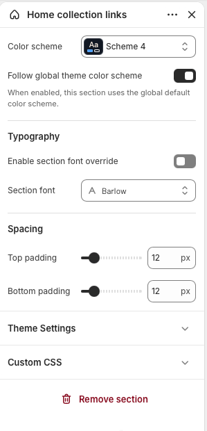
Use Color scheme to match the section to the rest of the page. Enable
Follow global theme color scheme when you want the section to inherit the
storewide default.
Typography and spacing
Turn on the section font override only when this area needs a different font from the global
theme typography. Adjust top and bottom padding to tighten the section or create more breathing
room between neighboring homepage sections.
Section settings control the overall color, typography, and spacing for the collection link row.
Collection tile settings
Collection tile blocks are the individual selectors inside this section. Each tile links to one selected
Shopify collection, so merchants can guide customers to category pages, campaign pages, sale collections, or
curated product lists. When a collection is selected, the tile uses that collection URL and collection image
by default. The image can still be overridden when a campaign, category, or seasonal page needs a custom
visual. Add more tiles when the homepage needs more shortcuts, or remove tiles when the row should stay
focused.
In the preview, each visible tile represents one Collection tile block. The block settings on the right
control which collection the tile links to, plus optional image, title and description overrides.
Select a Collection tile block inside the Home collection links section.
Choose the collection that the tile should link to. The theme uses the selected collection URL and
collection image automatically.
Optional: add an override image when you want the tile to use a campaign image instead of the collection
image.
Optional: add a title override when the storefront label should be shorter, more seasonal, or more
customer-friendly than the collection title.
Optional: add a short description if the design or future layout uses supporting copy for collection
tiles.
Best practice: Keep the row focused. Use the most important collections first, choose
images with similar visual weight, and use short labels so the section stays easy to scan on mobile.
Homepage section
Home hero with deals
The Home hero with deals section combines a large campaign slider with a compact deals list. Use the slider
for seasonal promotions, launches, collection stories, or brand messages, and use the deals panel to feature
discounted products beside the hero without sending customers away from the main homepage path.
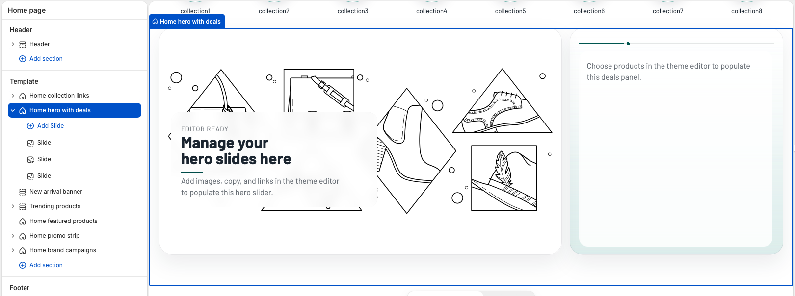
The section displays slide blocks in the large hero area and a product deals list on the right. Add or
reorder Slide blocks to control the slider, and use the section settings to choose which products appear
in the deals panel.
Home hero with deals settings
Template position
Add Home hero with deals to the Home page template and place it near the top of
the page when the store needs a strong campaign entry point. The section supports up to six
Slide blocks, and only slides with an image are displayed on the storefront.
Section style
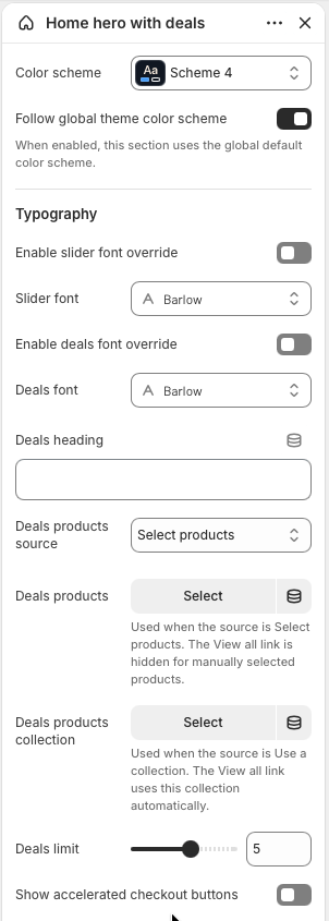
Use Color scheme to style the hero and deals panel. Keep
Follow global theme color scheme enabled when this section should inherit the
storewide default color scheme.
Typography
The slider and deals panel can use the global homepage font, or each area can use its own font.
Enable Slider font override or Deals font override only when the
campaign content needs a deliberate typography change.
Deals products
Set Deals heading, then choose the Deals products source. Select
individual products for a hand-picked list, or choose a collection when the deals should stay in
sync with a sale, clearance, or campaign collection.
Limit and links
Use Deals limit to show between one and eight products. The
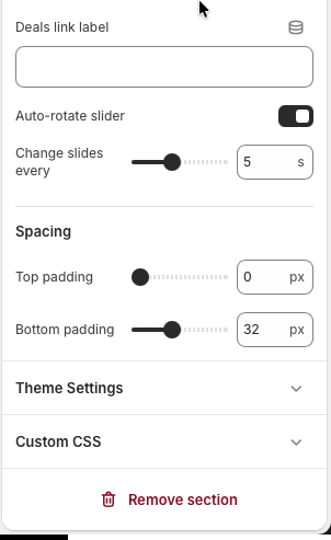
Deals link label appears only when the source is a collection, because the link
automatically points to the selected collection.
Checkout and slider timing
Enable Show accelerated checkout buttons when direct payment buttons should be
available for single-variant products. Use Auto-rotate slider and
Change slides every to control slider movement.
Spacing
Adjust top and bottom padding to control how tightly the hero sits against the header and nearby
homepage sections.
The section is built from Slide blocks. Add more blocks for more slider items, or reorder blocks to
change the slide sequence.
Deals settings choose the products shown in the right panel, while slider settings control autoplay
and slide speed.
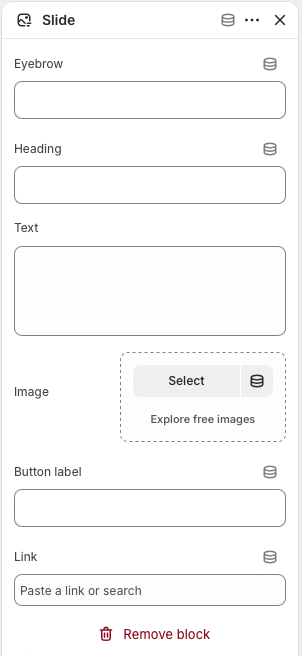
Slide block settings
Each Slide block creates one item in the hero slider. A slide needs an image before it appears on the
storefront. Optional text fields create the overlay content, and the link turns the slide into a
clickable promotion.
Select a Slide block inside the Home hero with deals section.
Add an Image. Slides without an image are skipped, so this is the required visual
field for each slider item.
Add an optional Eyebrow, Heading, and Text to
create the overlay message.
Add a Button label and Link when the slide should send customers
to a collection, product, page, or campaign URL.
Repeat with additional Slide blocks, then drag blocks into the order customers should see them.
Best practice: Use slides with similar image crops and visual density, keep slide
copy short, and choose deals products with visible compare-at prices when the section is being used as
a sale or discount feature.
Configure each Slide block with campaign text, a strong image, an optional button label, and a
destination link.
Homepage section
New arrival banner
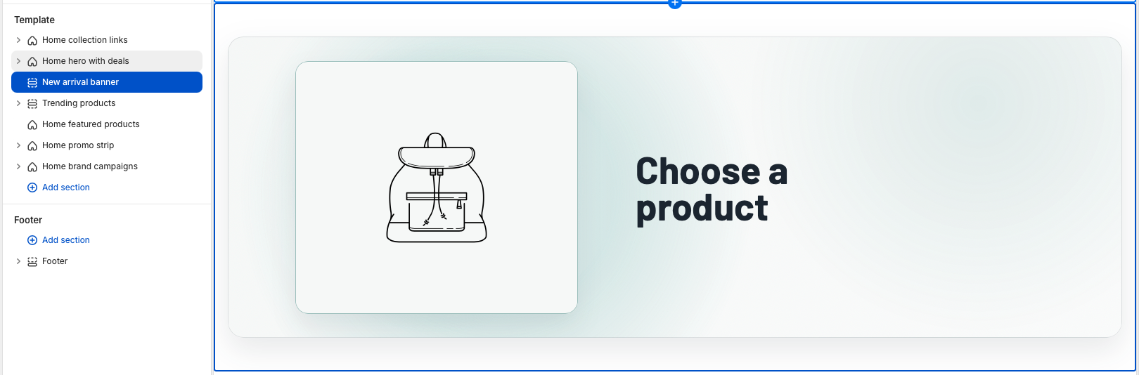
The New arrival banner section highlights one selected product in a focused promotional banner. Use it for a
recent launch, a restock, a seasonal product, or any item that needs more visual emphasis than a standard
product card.
The banner uses the selected product image and product URL, while the text settings control the badge,
heading, description, and button shown beside the product.
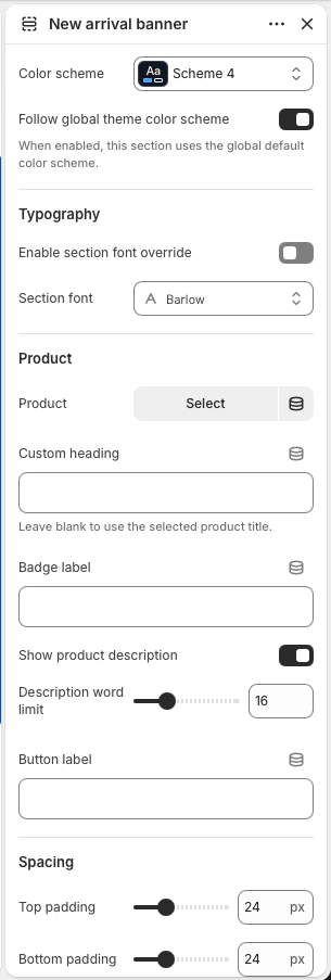
New arrival banner settings
Section style
Use Color scheme to match the banner to the surrounding homepage sections. Keep
Follow global theme color scheme enabled when the banner should inherit the
storewide default colors.
Typography
The banner uses the homepage typography by default. Enable
Section font override and choose a Section font only when this
product feature needs its own type style.
Product
Choose the product to feature. The section links the button to this product and uses the product's
first image, falling back to the featured image when needed. If no product is selected, the
section is only shown in the theme editor as a setup prompt.
Heading and badge
Add a Custom heading when the banner needs campaign copy. Leave it blank to use
the selected product title automatically. Use Badge label for short text such as
New arrival, Restocked, Limited drop, or Online exclusive.
Description
Enable Show product description to display a shortened version of the selected
product description. Use Description word limit to keep the banner concise and
balanced across desktop and mobile layouts.
Button and spacing
Set Button label for the product link text. Adjust top and bottom padding to
control how much space the banner has between neighboring homepage sections.
Select one product, then refine the text, description length, button label, color scheme, typography,
and spacing from the section settings.
Best practice: Choose a product with a clean primary image and keep the custom heading
short. This section works best when it promotes one clear product story instead of trying to explain a full
collection.
Homepage section
Trending products
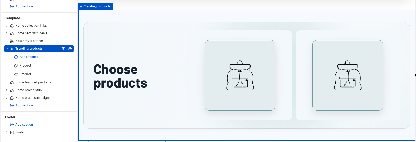
The Trending products section creates a focused product feature with promotional copy on one side and a
small set of selected products on the other. Use it for best sellers, high-interest launches, seasonal
picks, or any curated group that should receive stronger emphasis than a standard product grid.
The section combines merchant-entered marketing content with Product blocks. Each selected product block
displays as a clickable product image, while the main button can link to the first product or to a custom
destination.
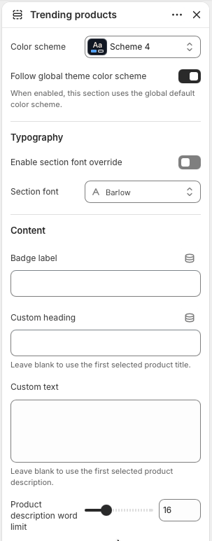
Trending products settings
Section style
Use Color scheme to align the panel with the rest of the homepage. Keep
Follow global theme color scheme enabled when the section should use the
storewide default colors.
Typography
The section inherits homepage typography by default. Enable
Section font override and choose a Section font only when this
featured product group needs a distinct type treatment.
Content
Set the Badge label, Custom heading, and
Custom text for the promotional copy. If the heading or text is left blank, the
theme uses the first selected product title and description as fallback content.
Description length
Use Product description word limit to control fallback text length when Custom
text is empty. This keeps product descriptions from becoming too long inside the banner layout.
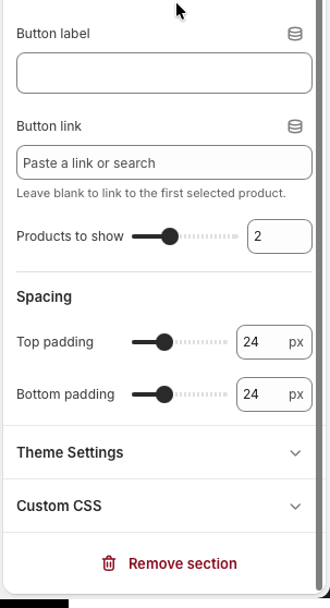
Button
Set Button label for the call to action. Add a Button link when
the button should go to a collection, campaign page, or another destination. Leave it blank to
link automatically to the first selected product.
Product count
Use Products to show to display between one and four product blocks. The desktop
layout adapts the product columns to the selected count, while smaller screens collapse into a
mobile-friendly layout.
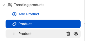
Product blocks
Add one Product block for each item in the curated set. The section supports up
to four blocks. Each block links to its selected product and uses the product featured image,
falling back to the first product image when needed.
Spacing
Adjust top and bottom padding to control the distance between this feature and neighboring
homepage sections.
Section settings control the panel style, marketing copy, fallback description length, call to
action, product count, and spacing.
Product blocks define the exact products shown in the visual product area. Add, remove, and reorder
blocks to change the curated product set.
Select products
Product selection happens inside each Product block, not in the main section
settings. Add a Product block, open the block settings, and use the product selector to choose the
exact item that should appear in the Trending products visual area.
In the Trending products section, select an existing Product block or add a new
one.
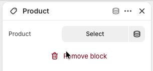
Click the Product picker in the block settings.
Search for the product, select it from the picker, and confirm the selection.
Repeat for each Product block, then reorder the blocks if the products should appear in a different
sequence.
Tip: Match the number of selected Product blocks with the
Products to show setting. If Products to show is lower than the number of blocks, the
extra blocks remain configured but are not displayed.
Open a Product block and click the product picker to choose the item for that block.
After a product is selected, the block controls that product image and link in the storefront
layout.
Best practice: Keep the product group tightly curated. Two to four related products usually
work best, especially when the heading and button describe one clear buying path.
Homepage section
Home featured products
The Home featured products section displays products from one selected collection in a clean product grid.
Use it for popular products, best sellers, new edits, seasonal collections, or any collection that should be
easy to browse directly from the homepage.
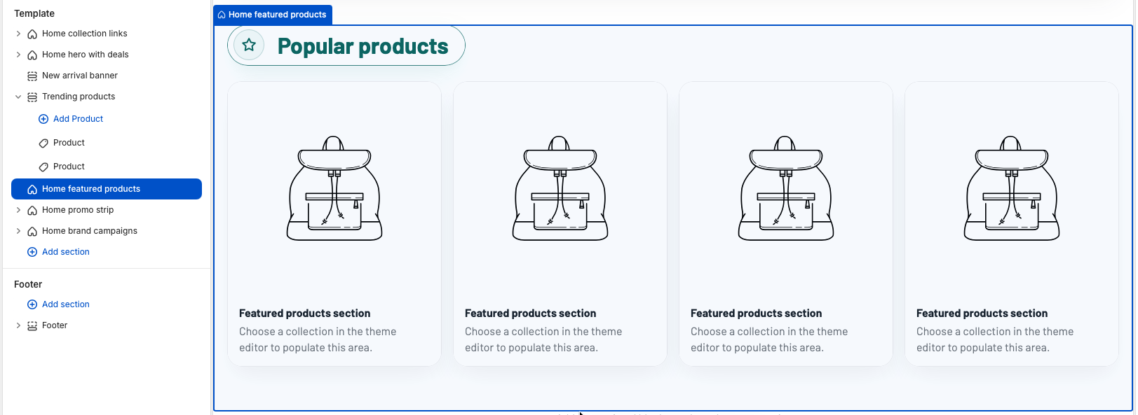
The section uses one horizontal product row on desktop. When no collection is selected, placeholder cards
appear in the theme editor so merchants can still understand the layout before choosing products.
Home featured products settings
Section style
Use Color scheme to style the section. Keep
Follow global theme color scheme enabled when this product row should inherit the
storewide default colors.
Typography
The section inherits homepage typography by default. Enable
Section font override and choose a Section font only when this
product row needs its own heading and card text style.
Header content
Set Heading for the title shown above the grid. Add optional
Text when the row needs a short collection note, and use
Link label for the header call to action. The link automatically points to the
selected collection page.
Collection
Choose the Collection that supplies the product cards. The section shows products
from this collection in collection order until the product limit is reached.
Product count
Use Products limit to show between four and twelve products from the selected
collection. The section shows products in collection order until the limit is reached.
Desktop columns
Use Products per row on desktop to choose three, four, or five columns. Mobile
keeps the grid compact with two columns, while tablet screens use three columns.
Product card options
Enable Show vendor when brand or vendor names help customers compare products.
Enable Show secondary image to reveal another product image in cards that have
more than one image.
Buying actions
Use Enable quick add for faster cart additions from the product cards. Use
Enable quick buy when direct checkout buttons should appear for eligible
products.
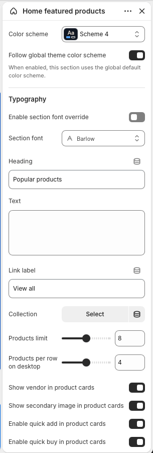
The main settings select the collection, control the row title and link, set the product limit, and
choose how many product cards appear per desktop row.
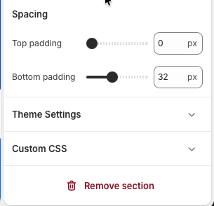
Spacing settings adjust the vertical room above and below the product row.
Set up the section
Add Home featured products to the Home page template.
Choose the collection whose products should appear in the row.
Edit the heading, optional text, and link label so the section clearly describes the collection.
Set the product limit and desktop column count based on how much space the section should occupy.
Review vendor, secondary image, quick add, and quick buy settings to match the store's buying flow.
Best practice: Select a collection with strong product images and keep the heading short.
Four products with four desktop columns works well for a single horizontal row, while higher limits create
a deeper browse area for larger collections.
Homepage section
Home promo strip
The Home promo strip section creates a row of short promotional discount boxes. Use it for sale messages,
category-specific discounts, loyalty offers, shipping incentives, or quick campaign links that should sit
between larger homepage sections.
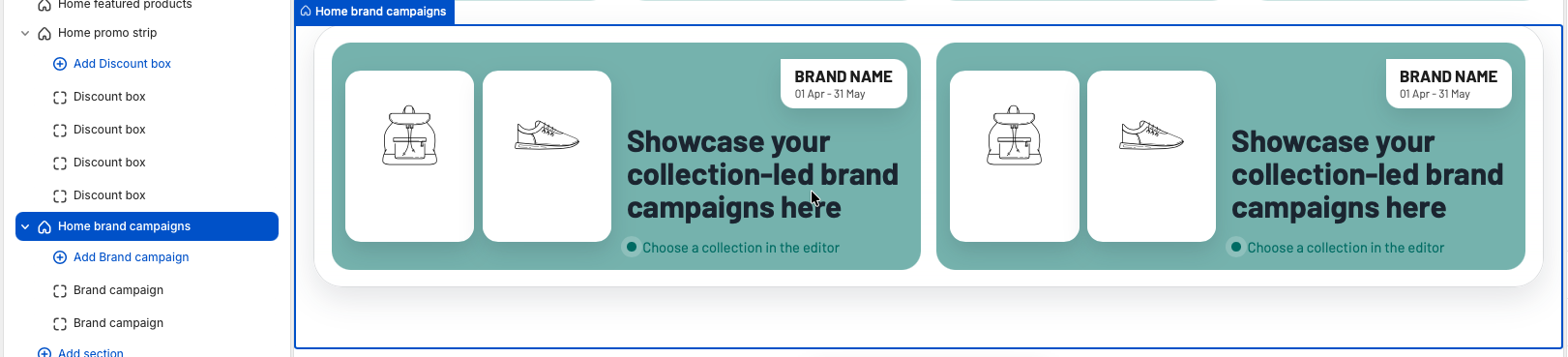
On desktop, the strip displays discount boxes in one horizontal row. The section is block-based, so each
visible box comes from one Discount box block.
Home promo strip settings
Section style
Use Color scheme to align the strip with the homepage. Keep
Follow global theme color scheme enabled when the section should inherit the
storewide default color scheme.
Color source
Enable Use selected color scheme colors when the strip should use theme color
tokens. Disable it only when the section needs the manual Background color
setting instead.
Typography
The strip uses homepage typography by default. Enable Section font override and
choose a Section font when the discount values and labels need their own type
style.
Manual background
Background color is used only when
Use selected color scheme colors is disabled. This lets a merchant create a
campaign-specific band without changing the global theme color scheme.
Spacing
Adjust Top padding and Bottom padding to control how tightly
the promo row sits between neighboring homepage sections. The default compact spacing works well
for a strip between product rows or campaign banners.
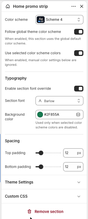
Section settings control the strip colors, font, optional manual background, and vertical spacing.
Discount box blocks
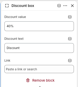
Discount value
Use Discount value for the large headline number or offer text, such as
40%, Free, or 2+1. Keep it short so the card
remains balanced across desktop and mobile.
Discount text
Use Discount text for the short label below the value, such as Discount, Off
selected items, Free shipping, or Members only.
Link
Add a Link when the discount box should open a collection, product, page, or
campaign URL. If the link is blank, the box displays as a non-clickable promotional message.
Block display
A block appears when either Discount value or Discount text has
content. Empty blocks are skipped on the storefront, and the section shows an editor-only empty
message when no valid blocks exist.
Each Discount box block controls one promo card. Add, remove, and reorder blocks to change the strip
content.
Set up the section
Add Home promo strip to the Home page template.
Add one Discount box block for each offer you want to show.
Enter the discount value and short supporting text for each block.
Add links to boxes that should send customers to a promotion, collection, or product page.
Adjust color, typography, and spacing so the strip fits between nearby homepage sections.
Best practice: Keep each box short and consistent. Four boxes create a balanced desktop
row, while the mobile layout naturally stacks them into a compact two-column grid.
Homepage section
Home brand campaigns
The Home brand campaigns section highlights collection-led campaigns with editorial product imagery and
short campaign copy. Use it for brand edits, seasonal drops, collaborations, gift guides, or any collection
that benefits from a stronger visual story than a standard product row.
Campaign cards use a horizontal layout with two product images, a brand badge, campaign text, and a
highlight label. On wide screens, the section displays two campaign cards in one row.
Home brand campaigns settings
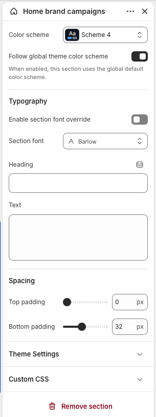
Section style
Use Color scheme to style the campaign frame and cards. Keep
Follow global theme color scheme enabled when this section should inherit the
storewide default color scheme.
Typography
The section inherits homepage typography by default. Enable
Section font override and choose a Section font only when the
campaign heading, badges, and card copy need a distinct type style.
Header content
Set Heading for the section title and use Text for a short
explanation above the campaign cards. If both fields are blank, the header area is hidden and only
the campaign cards are shown.
Spacing
Adjust Top padding and Bottom padding to control the distance
between this campaign frame and surrounding homepage sections.
Section settings control the global campaign frame, heading content, typography, color scheme, and
spacing.
Brand campaign blocks
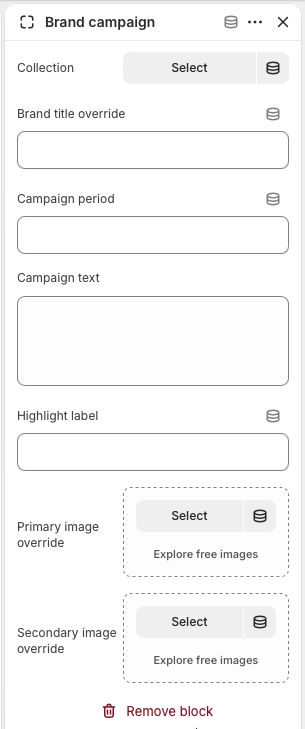
Collection
Choose the Collection that the card should feature. This field is required for a
real campaign card; blocks without a collection are skipped, and each card links automatically to
the selected collection.
Campaign label
Use Brand title override when the card should show a shorter or more editorial
brand name than the collection title. Add Campaign period for date ranges,
launch windows, or limited-time campaign messaging.
Campaign copy
Use Campaign text for the main message inside the card. Add a
Highlight label for a short supporting note, such as Choose a collection,
Limited edition, Online exclusive, or Shop the edit.
Image overrides
Add Primary image override and Secondary image override when
the campaign needs custom editorial imagery. If they are blank, the section uses product images
from the selected collection, then falls back to the collection image when needed.
Block order
Add, remove, and reorder Brand campaign blocks to control which campaigns appear
first. The section supports up to eight campaign blocks.
Each Brand campaign block controls one campaign card and links the entire card to the selected
collection.
Set up the section
Add Home brand campaigns to the Home page template.
Add one Brand campaign block for each collection-led campaign.
Select a collection in each block so the campaign card has a destination and product image fallbacks.
Add optional title, period, campaign text, highlight label, and image overrides to shape the editorial
message.
Reorder the blocks so the most important brand or collection campaign appears first.
Best practice: Use collections with strong product imagery and keep campaign text concise.
Two campaign cards make a balanced desktop row, while additional blocks create a deeper campaign grid.
Product page
The product page is the main conversion template for the theme. It combines a large media gallery, variant
selection, price and compare-at price messaging, quantity controls, add to cart, accelerated checkout,
product description, detail tabs, breadcrumbs, support content, complementary products, and related
products.
Variant changes should update the price and the relevant media.
Product media should be tested with images and video.
The add-to-cart area should remain easy to reach on mobile.
Product template
Product page template
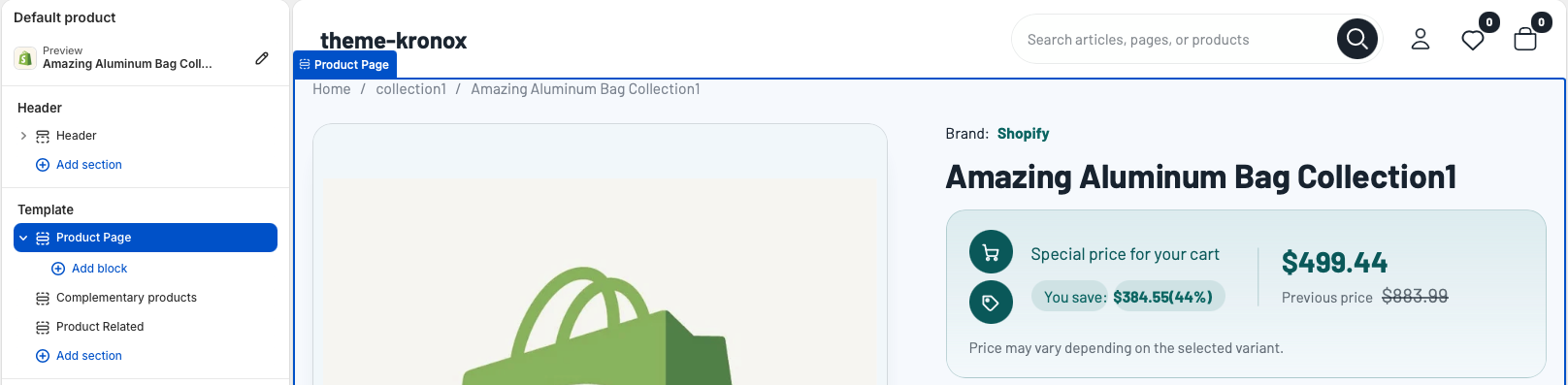
Open the Shopify theme editor and choose Default product from the page selector. The
product template is built with the main Product Page section followed by product discovery
sections such as Complementary products and Product Related. Merchants can
reorder the discovery sections, while the Product Page section should stay at the top because it contains
the purchase flow.
Use the Default product template to configure the main product layout. The Product Page section controls
the gallery, product information, variant form, breadcrumbs, and layout spacing.
Best practice: Keep the main Product Page section first in the template. Add supporting
merchandising sections below it so customers can complete the purchase flow before browsing additional
recommendations.
Product section
Product Page section
The Product Page section is powered by Shopify product data and does not require merchants to choose a
specific product manually. It uses the currently viewed product, selected variant, product media,
collections, tags, inventory, selling plans, and gift card settings.
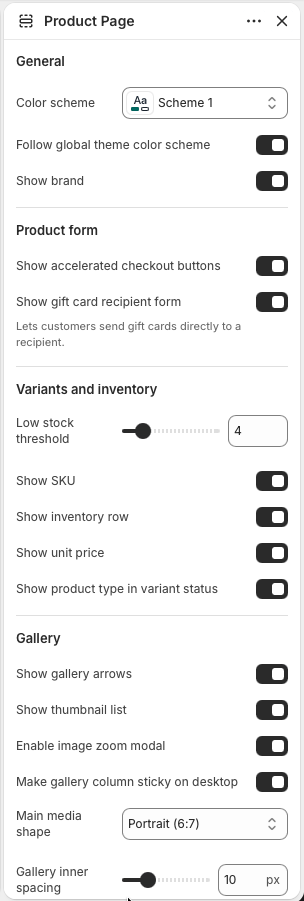
General and product form settings
Color scheme
Use Color scheme when this product template needs a specific palette. Keep
Follow global theme color scheme enabled when product pages should inherit the
storewide default colors.
Brand
Enable Show brand when the vendor helps customers compare products or when brand
recognition is important for the catalog. Disable it for stores where vendor names are internal
labels.
Accelerated checkout
Enable Show accelerated checkout buttons to display Shopify dynamic checkout
buttons below the add-to-cart action when the selected variant can be purchased.
Gift cards
Enable Show gift card recipient form so gift card products can collect recipient
details. This option appears only where Shopify's gift card product behavior applies.
Inventory details
Use Low stock threshold, Show SKU,
Show inventory row, Show unit price, and
Show product type in variant status to tune how much availability information is
shown near the purchase form.
The first Product Page settings group controls color, brand display, checkout buttons, gift card
recipient fields, inventory messaging, and the beginning of the gallery controls.
Product media
Gallery
The gallery displays the product media assigned in Shopify admin. It supports multiple product images and
media items, thumbnail navigation, previous and next arrows, variant-linked media changes, and an optional
zoom modal for closer inspection.
Upload product images, videos, or 3D media in Shopify admin.
Assign variant images where each option should open a specific product media item.
In the Product Page section, choose whether to show gallery arrows and thumbnails.
Select the main media shape and thumbnail size based on the store's product photography.
Best practice: Use consistent image crops across a product whenever possible. Mixed image
ratios are supported, but consistent crops make the gallery feel calmer and help customers compare variants.
Product content
Product information
Product information settings control the description area, details tab, variant metadata, tags, and
typography. These options let merchants decide how much catalog data should appear on the product page
without editing Liquid.
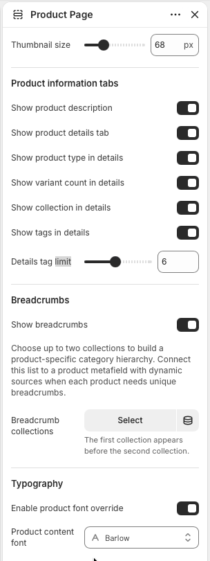
Description
Enable Show product description when the product's Shopify description should
appear in the product information tabs. Keep descriptions structured with short paragraphs,
lists, and clear sizing or care notes.
Details tab
Enable Show product details tab to show structured product metadata. The details
tab can include product type, variant count, collection, and tags depending on the enabled
settings.
Tags and limits
Enable Show tags in details when tags are customer-friendly. Use
Details tag limit to prevent long tag lists from overwhelming the details tab.
Typography
Enable Product font override only when product pages need a different type style
from the global theme typography. Choose Product content font to control the
product page heading, form, and supporting content typography.
Product information settings decide which product details are shown, how many tags appear, how
breadcrumbs are built, and whether the product page uses a custom font.
Navigation
Breadcrumbs
Breadcrumbs help customers understand where the product sits in the catalog. Enable
Show breadcrumbs to display a path above the product layout. The section can use the
current collection, the product's first collection, or up to two selected breadcrumb collections.
Enable Show breadcrumbs in the Product Page section.
Optional: choose up to two Breadcrumb collections to build a more specific hierarchy.
Use dynamic sources for breadcrumb collections when each product needs its own category path.
Best practice: Use breadcrumb collections that are visible and useful to shoppers. Avoid
internal merchandising collections that customers would not understand as navigation.
Product blocks
Blocks
The Product Page section supports app blocks, custom Liquid, support cards, and custom accordions. Blocks
are useful for product-specific services, delivery promises, care instructions, warranty notes, sizing
guidance, or app-powered content.
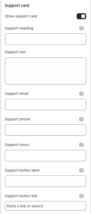
Support card
Use Support card blocks for short reassurance points such as dispatch time, secure checkout, returns,
or warranty coverage. The section supports up to four support cards.
Custom accordion
Use Custom accordion blocks for expandable information. Each block can use rich text or pull content
from a selected page, which keeps repeated policies easier to maintain.
App and custom Liquid
Use app blocks for Shopify apps that need to appear in the product purchase flow. Use Custom liquid
only for small trusted additions that cannot be handled by theme settings or app blocks.
Product recommendations
Product discovery
The default product template includes Complementary products and
Product Related sections below the main Product Page section. Use these areas to help
customers continue shopping after they understand the current product.
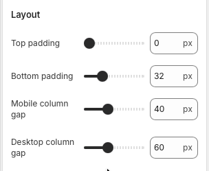
The Product Page layout controls adjust the vertical padding around the main product section and the
spacing between the gallery and product information columns. The discovery sections below have their own
padding controls.
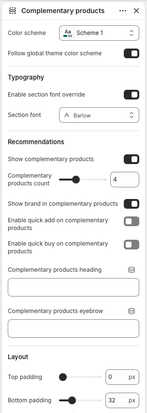
Product recommendations
Complementary products
The Complementary products section shows Shopify product recommendations with the complementary intent. It
is best for accessories, add-ons, bundles, refills, matching pieces, or products that complete the item a
customer is viewing.
Section style
Use Color scheme to style this recommendation row. Keep
Follow global theme color scheme enabled when complementary products should use
the same palette as the rest of the product template.
Typography
Enable Section font override only when this row needs its own typography. Use
Section font to match the recommendation heading and cards to a campaign or
product family.
Recommendations
Enable Show complementary products, then set
Complementary products count between two and eight products. The section uses
Shopify's complementary recommendation data for the current product.
Product card options
Enable Show brand in complementary products when vendor names help customers
compare items. Use Enable quick add or Enable quick buy only
when the recommended products are simple enough to buy from a card.
Heading and eyebrow
Set Complementary products heading and
Complementary products eyebrow to explain why these items belong together. Short
labels such as Pairs well with or Complete the set work best.
Spacing
Adjust Top padding and Bottom padding to control how tightly
the row sits below the main product section or nearby recommendation sections.
Complementary products settings control the row style, font, recommendation count, brand display,
quick purchase options, heading text, and vertical spacing.
Best practice: Keep quick add disabled when complementary products have many variants or
require careful selection. A clean product card link is often better than a rushed add-to-cart action.
Product recommendations
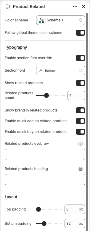
Product related
The Product Related section displays alternatives from the product's active or primary collection. It helps
customers continue browsing similar items when the current product is not the perfect fit.
Section style
Use Color scheme for the related products row. Keep
Follow global theme color scheme enabled when the row should match the product
page's global color treatment.
Typography
Enable Section font override and choose a Section font only
when the related products row needs a distinct text style from the main product page.
Related products
Enable Show related products and set
Related products count between two and eight products. The section appears only
when the current product has a collection with more products to show.
Product card options
Enable Show brand in related products when brand names are useful in comparison.
Enable quick add supports faster cart additions, while
Enable quick buy is useful when direct checkout makes sense for the catalog.
Heading and eyebrow
Use Related products eyebrow for a small contextual label. Use
Related products heading for the main row title, such as You may also like.
Spacing
Adjust Top padding and Bottom padding to create enough
separation from complementary products, reviews, or other product-template sections.
Product Related settings control the row style, font, product count, vendor display, quick purchase
options, heading text, and vertical spacing.
Best practice: Related products should feel like helpful alternatives, not a random grid.
Make sure products are assigned to useful collections so this row can surface relevant choices.
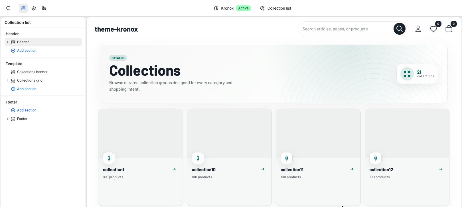
Collection List
The Collection list template is the storewide collection index. It combines a
Collections banner section with the Collections grid section, which
paginates Shopify collections and renders reusable collection cards.
Open the Shopify theme editor and choose Collection list. Keep
Collections banner above Collections grid so customers first understand
the catalog index, then browse into a specific collection.
Template behavior: The grid uses Shopify's global collections object. It does
not require merchants to select every collection manually, and it includes app block support for extensions
that need to appear above the collection cards.
Collection list header
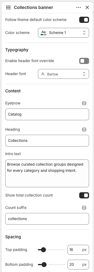
Collections banner
The Collections banner introduces the index page with an eyebrow, heading, intro text, and optional total
collection count. If the heading is left blank, the section falls back to the translated collections title.
The count badge uses the current number of collections available to the template.
Color scheme
Keep Follow theme default color scheme enabled when the collection index should
inherit global theme colors. Choose Color scheme only when the list page needs a
different palette from the rest of the storefront.
Typography
Enable header font override when the banner needs a different display font. The
selected font is applied to the banner container, including the title, eyebrow, intro, and count
badge.
Content
Use Eyebrow, Heading, and Intro text to set
the page context. Enable Show total collection count to display the count badge,
then edit Count suffix when the store needs different wording.
Spacing
Top padding and Bottom padding control the banner's vertical
rhythm. The default spacing keeps the header close to the grid while still separating it from the
storefront header.
Banner settings control the top of the collection index and should describe the overall catalog, not
one specific collection.
Collection cards
Collections grid
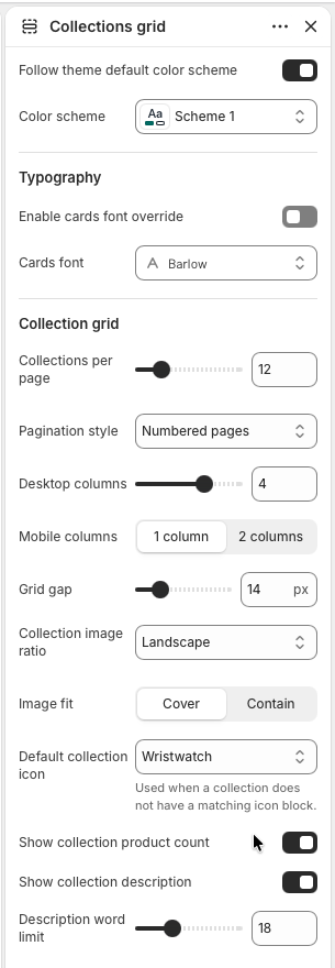
The Collections grid section paginates all published collections and renders each one as a linked card.
Cards use the collection featured image when available, a Shopify placeholder when missing, the collection
title, optional product count, and optional truncated description.
Color and typography
The grid can inherit the global color scheme or use a specific scheme. Enable
cards font override only when collection cards should use a different font from
the main theme typography.
Pagination
Collections per page controls the Liquid paginate size. Choose numbered pages
for predictable navigation, a load-more button for progressive browsing, or infinite scroll for a
more continuous collection discovery flow.
Grid layout
Set Desktop columns from 2 to 5 and Mobile columns to 1 or 2.
Use Grid gap to tighten or loosen the card spacing across the index.
Images and default icon
Choose landscape, square, or portrait for Collection image ratio, then use
Image fit to decide whether images crop or contain. The
Default collection icon appears on any card without a matching Collection icon
block.
Card details
Enable Show collection product count for catalog-size context. Enable
Show collection description to display a plain-text excerpt, then use
Description word limit to keep card heights consistent.
Grid settings define how many collections appear at once and how each card presents image, icon, and
text details.
Empty state
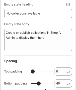
Empty state heading and Empty state body appear when there are
no collections available to render. Keep the message action-oriented so merchants understand they
need to create or publish collections in Shopify Admin.
Section spacing
Top padding and Bottom padding apply around the grid content,
app blocks, empty state, and pagination. The default bottom padding gives pagination controls room
before the footer.
Empty state and spacing settings keep the page useful even before the catalog has published
collections.
Grid blocks
Collection icon blocks
Collection icon blocks let merchants assign a specific icon to a specific collection card. During rendering,
the section loops through blocks and matches the selected block collection handle to the current card's
collection handle. When no matching block exists, the card uses the section's default collection icon.
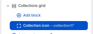
Add a block
Open Collections grid and choose Add block, then add a
Collection icon block. Blocks can be reordered in the editor, but the storefront
match is based on the selected collection, not the block position.
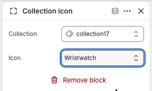
Choose collection and icon
Select the target Collection, then choose an Icon. Available
options are wristwatch, tag, percent, men, women, stack, clock, and grid. Use icon blocks for
important collections that need a clearer visual signal than the default icon.
Collection icon blocks live inside the Collections grid section.
Assign one collection and one icon per block. The default icon covers all unassigned cards.
Accessibility note: The card image link uses the collection title as its aria label, while
decorative card icons are hidden from assistive technology with aria-hidden="true".
Collection page
Collection pages are structured with grid layouts, sorting, filtering, and pagination to support large
catalogs. Shopify Search & Discovery filters can be used for product type, vendor, price, variant options,
and metafields.
Open the Shopify theme editor and choose Default collection. Keep
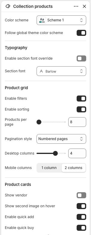
Collection banner at the top, then use Collection promotions for
optional merchandising tiles and Collection products for filters, sorting, product cards,
and pagination.
Template structure: The collection page is built from reusable OS 2.0 sections. The
sections use the current Shopify collection object, so merchants do not need to hardcode a collection,
product list, or product count in the template.
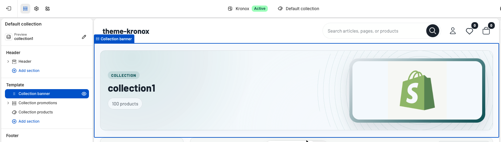
Collection header
Collection banner
The Collection banner section introduces the active collection with a title, optional description, product
count, and image. By default it uses the collection title, description, and featured image from Shopify
admin. Merchants can override those fields from the theme editor when a collection needs campaign-specific
copy or artwork.
Color scheme
Use Color scheme only when this collection header needs a dedicated palette.
Keep Follow global theme color scheme enabled to inherit the storewide default
colors from theme settings.
Typography
Enable section font override when the banner should use a different font from
the global primary font. The Liquid renders the selected font face and passes font variables into
the banner, so the heading, eyebrow, count pill, and description stay visually consistent.
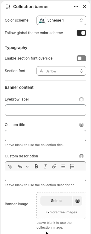
Banner content
Eyebrow label defaults to the collection label translation when left blank.
Custom title, Custom description, and
Banner image are optional overrides. Leave them empty to use the collection title,
collection description, and collection featured image.
Configure banner copy and image overrides only when the collection data itself should not be used.
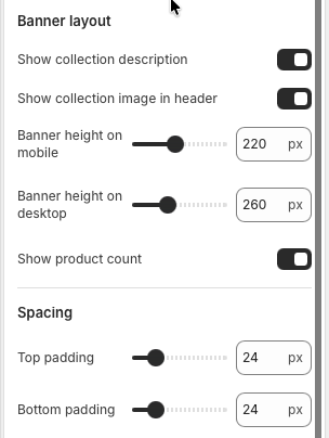
Banner layout
Enable Show collection description to display the collection description or the
custom rich text override. Enable Show collection image in header to add the
image column. If no image is available, the Liquid automatically keeps the banner as a copy-only
header.
Height and count
Banner height on mobile and Banner height on desktop control
the minimum header height through CSS variables. Show product count displays the
live collection.products_count value, which is useful for large catalogs and filtered
category browsing.
Spacing
Adjust Top padding and Bottom padding to control the distance
between the banner and neighboring template sections. The default 24px spacing keeps the banner
visually connected to the product grid without crowding the page.
Use layout settings to decide whether the collection page opens as a simple text header or a visual
banner.
Merchandising
Collection promotions
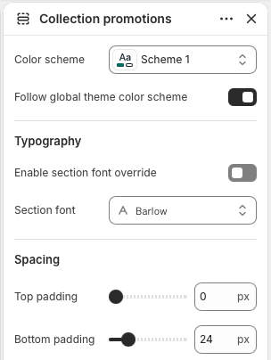
Collection promotions is an optional section for campaign tiles above the product grid. The section renders
only when blocks exist, which keeps empty collection templates clean. Use it for seasonal messages,
shipping offers, sale callouts, or links to related collections.
Section style
Color scheme and Follow global theme color scheme work the same
way as the banner. Use the global scheme for a quiet product-listing page, or choose a specific
scheme when promotional content needs stronger contrast.
Typography and spacing
The font override applies to the promotion tile text and button. Top padding and
Bottom padding control how tightly the tile row sits between the banner and the
collection products section.
Promo tile blocks
Add up to three Promo tile blocks. Each block has an image, heading, text, button
label, button link, and overlay accent color. The section also accepts app blocks, with a maximum
of four total blocks.
Keep promotion tiles focused. They should support collection browsing rather than push the product
grid too far down the page.
Product listing
Collection products
Collection products is the main catalog section. It paginates the current collection products, renders
Shopify filters from collection.filters, provides sorting from collection.sort_options,
and reuses the product showcase/card system for consistent product cards across the theme.
Filters and sorting
Enable filters to show Shopify Search & Discovery filter groups when the
collection has filters available. Filter groups support checkbox values and price ranges, active
filter counts, clear-all links, and a collapsible mobile panel. Enable sorting to
show the collection sort dropdown.
Grid and pagination
Products per page controls the Liquid paginate size. Choose
Numbered pages, Load more button, or
Infinite scroll. Desktop columns can be set from 2 to 5, while mobile supports 1
or 2 columns.
Product cards
Show vendor displays product vendor names when brand comparison matters.
Show second image on hover adds alternate product imagery.
Enable quick add and Enable quick buy expose faster purchase
paths from the grid when products support them.
These controls define how customers scan, narrow, sort, and purchase products from a collection.
Product badges
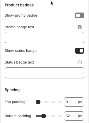
Enable Show promo badge and enter Promo badge text for campaign
labels such as sale, bundle, or limited-time messaging. Show status badge uses
the configured Status badge text, which defaults to "In stock".
Empty states
When a collection or filtered result has no products, the section displays the translated empty
state text and a clear-all link back to the collection URL. This prevents dead-end collection
pages after customers apply restrictive filters.
Spacing
Product section padding controls the vertical rhythm around the toolbar, filter sidebar, product
grid, and pagination. The default bottom padding gives numbered pagination or load-more controls
room before the footer.
Badge settings should be used for broad merchandising signals that apply across the collection grid.
Large catalog note: Configure product type, vendor, price, option, and metafield filters in
Shopify Search & Discovery. The theme reads those filter definitions automatically and keeps the sidebar
accessible with semantic form controls.
Cart
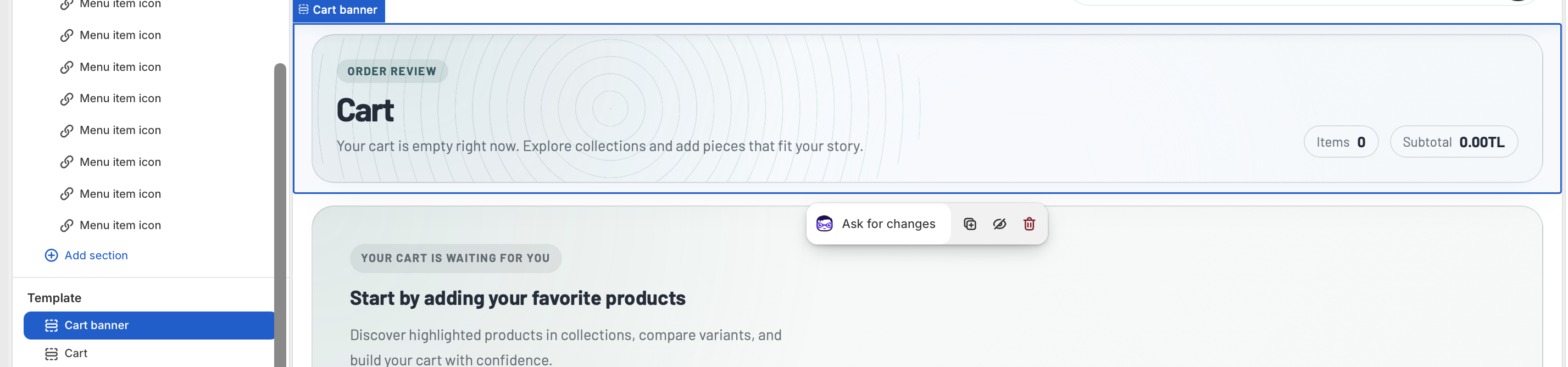
The cart template combines a clear order review banner, editable cart line items, an order summary, discount
code controls, accelerated checkout buttons, and optional product recommendations. It is built from three
reusable OS 2.0 sections: Cart banner, Cart, and
Cart recommendations.
Open the Shopify theme editor and choose Cart from the page selector. Keep the template
ordered as Cart banner, Cart, then Cart recommendations so customers first understand the order state,
then edit the cart, then browse helpful add-ons.
Template structure: The cart uses live Shopify cart data. Merchants do not need to select
products for the main cart area, and line items, prices, discounts, notes, checkout, and empty-cart states
are handled by Shopify objects and theme settings.
Cart header
Cart banner
The Cart banner section introduces the cart page and gives customers a quick summary before they edit their
order. It displays the translated cart title, item count, subtotal, total savings when discounts are active,
and short copy that changes between filled and empty cart states.
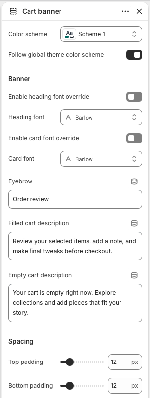
Color scheme
Keep Follow global theme color scheme enabled when the cart should inherit the
storewide default colors. Choose a specific Color scheme only when the cart page
needs a dedicated campaign or checkout palette.
Typography
Use Enable heading font override only when the cart banner needs a dedicated
heading font. Leave it disabled to keep the cart aligned with the global theme typography.
Banner copy
Eyebrow appears above the cart title. Filled cart description
is shown when the cart has items, while Empty cart description is shown when the
cart has no items. Keep both descriptions short because the banner also includes live summary
pills.
Spacing
Top padding and Bottom padding control the vertical rhythm
around the banner. The default 12px spacing keeps the banner visually close to the cart controls.
Banner settings control the cart introduction and switch copy automatically between filled and empty
cart states.
Cart controls
Cart section
The Cart section is the functional center of the template. It renders each line item, product image,
variant details, selling plan details, custom line item properties, quantity controls, remove links, cart
notes, discount code controls, subtotal rows, checkout, dynamic checkout buttons, and the empty cart state.
Empty cart
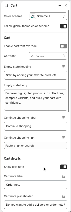
Empty state heading and Empty state body are shown only when
the cart has no items. Use them to guide customers back into browsing rather than explaining the
cart mechanics.
Continue shopping
Continue shopping label controls the link text. If
Continue shopping link is empty, the section falls back to the all products
collection, so the link always has a safe destination.
Cart note
Enable Show cart note when customers should leave delivery instructions, gift
notes, or order comments. Cart note label and
Cart note placeholder keep the field clear for the store's order workflow.
The first Cart settings group controls the empty cart experience, continue shopping link, and cart
note field.
Line item details
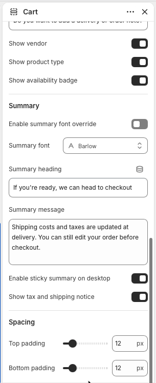
Show vendor, Show product type, and
Show availability badge add small context pills to each cart item. Enable them
for large catalogs where customers may compare brands, categories, or in-stock status.
Summary card
Summary heading and Summary message appear above the checkout
action. The summary automatically includes subtotal, line-item savings, cart-level discounts,
total, discount code input, checkout, dynamic checkout buttons, and the optional tax and shipping
notice.
Sticky checkout
Keep Enable sticky summary on desktop on for longer carts so checkout remains
easy to reach while customers review line items. Disable it only if another app or custom layout
needs the summary to scroll normally.
Tax notice and spacing
Show tax and shipping notice displays the translated Shopify tax message below
checkout. Adjust section padding when the cart sits close to banner or recommendation sections.
The second Cart settings group controls product metadata, order summary copy, sticky behavior, tax
notice, and section spacing.
Cart merchandising
Cart recommendations
Cart recommendations adds a product grid below the cart. It can use a selected collection, or if no
collection is selected, it falls back to the first collection found on a product currently in the cart. The
section skips products already in the cart so recommendations stay useful.
Source collection
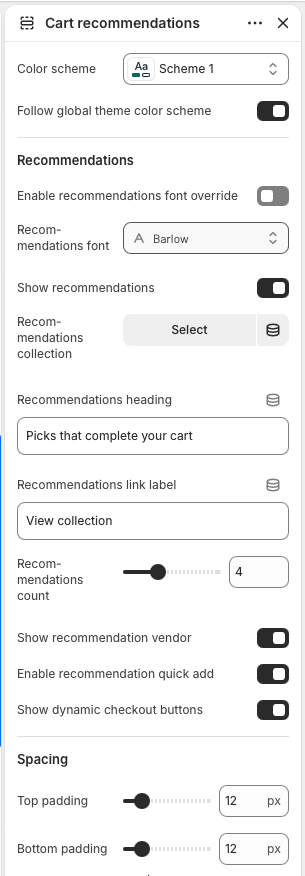
Enable Show recommendations, then choose a
Recommendations collection for curated add-ons. Leave the collection empty when
the fallback collection from cart items should drive the recommendations automatically.
Heading and link
Recommendations heading labels the product grid, while
Recommendations link label controls the link to the source collection. The
collection title is also shown as a small eyebrow above the heading.
Product card options
Set Recommendations count between two and eight products. Use
Show recommendation vendor, Enable recommendation quick add,
and Show dynamic checkout buttons to match the store's product card buying flow.
Visibility
The section renders only when recommendations are enabled and a collection is available. If the
selected or fallback collection has no eligible products, the storefront stays clean instead of
showing an empty grid.
Use Cart recommendations for complementary products, last-minute accessories, refill items, or
collection-based discovery below the checkout flow.
Before publishing
Cart testing checklist
Test the empty cart state and confirm the continue shopping link has the right destination.
Add products with variants, discounts, selling plans, and custom properties to confirm line item details render correctly.
Update quantities, remove items, apply and remove discount codes, then confirm totals update as expected.
Check the cart note field, checkout button, and dynamic checkout buttons on desktop and mobile.
Confirm recommendation products do not duplicate items that are already in the cart.
Search
The search template gives customers a dedicated place to browse matching products, pages, and blog articles.
It includes result summary messaging, product cards, optional filters and sorting, editorial result cards,
pagination, and clear empty or ready states.
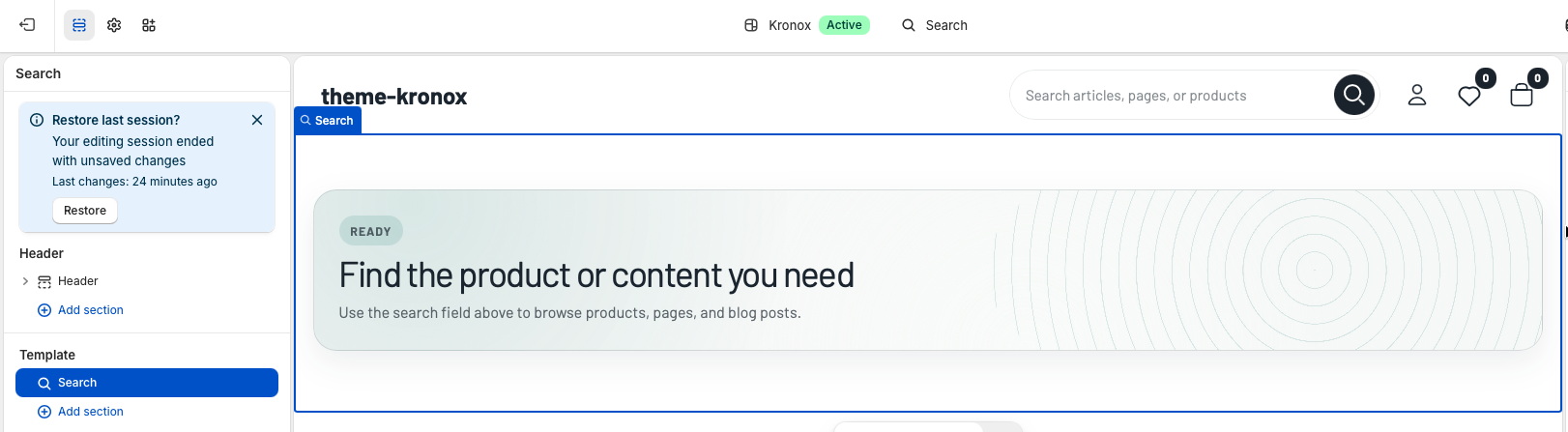
Open the Shopify theme editor and choose Search from the page selector. The template is
powered by one reusable Search section that reads the live Shopify search object instead
of requiring merchants to select products or content manually.
Template structure: Search results are generated from Shopify search data. Product results
are displayed with the theme's product card system, while article and page results are shown as editorial
cards. Empty searches and searches with no matches use translated status messages.
Template section
Search section
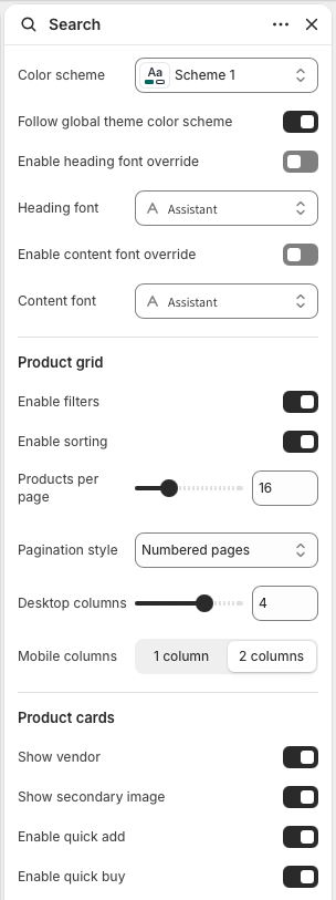
The Search section controls the page style, product grid density, result controls, and product card actions.
It is designed for stores with small or large catalogs because the same section can show a compact product
grid, a filter sidebar, sorting, and progressive pagination.
Color scheme
Keep Follow global theme color scheme enabled when the search page should inherit
the storewide default palette. Choose a specific Color scheme only when search
needs a dedicated visual treatment.
Typography
Use Enable heading font override for result headings and status cards. Use
Enable content font override for body copy, controls, filters, and card text.
Leave both disabled to keep search aligned with global theme typography.
Product grid
Enable filters displays Shopify search filters when they are available.
Enable sorting adds the search sort selector. Products per page
controls pagination size, while Desktop columns and
Mobile columns set the product card grid density.
Pagination style
Choose Numbered pages for predictable navigation,
Load more button for customer-controlled browsing, or
Infinite scroll for a continuous discovery experience.
Product cards
Show vendor and Show secondary image control card details.
Enable quick add and Enable quick buy let customers move from
search results to purchase faster when the product card supports those actions.
Search settings focus on catalog browsing controls: filters, sorting, pagination, grid columns, and
product card actions.
Customer experience
Results behavior
When a customer performs a search, the section shows a status banner with the result count and search term.
Product results are rendered first in the product grid. Article and page results are displayed below as
editorial cards with type labels, images when available, excerpts, and article publish details.
Before searching
If no search has been performed, the page shows a ready state that asks customers to use the search
field. This keeps the template useful even when someone lands on the search page directly.
No results
If Shopify returns zero matches, the section displays an empty state with the searched term and a zero
result count. The copy is translated through locale strings, so it can be localized with the rest of
the theme.
Filters and sorting
Filters are read from search.filters and submitted through a semantic form. Configure
product type, vendor, price, option, and metafield filters in Shopify Search & Discovery. The
theme preserves the active search term and result type while filters or sorting are applied.
Progressive loading
Load more and infinite scroll fetch the next results page, append product and editorial cards, and
refresh product card behaviors such as quick actions and image sliders. Status text uses live regions
so assistive technology receives loading feedback.
Search setup note: Predictive search is normally surfaced in the header search field. This
page handles the full results experience after a query is submitted, including filters, sorting, result
summaries, and pagination.
Quality check
Checklist
Catalog filters
Confirm Shopify Search & Discovery filters are configured, then test product type, vendor, price,
variant option, and metafield filters from the search results page.
Mixed results
Test queries that return products, pages, and articles. Product cards should remain in the grid, and
editorial results should appear as separate article or page cards.
Responsive layout
Check one-column and two-column mobile grid settings, filter panel behavior, sort controls, and
pagination on mobile and desktop.
Empty states
Visit the search page before submitting a query and test a query with no matches. Both states should
show clear translated messaging and should not leave an empty product grid on the page.
Blogs
The Blogs page documents the blog listing template. It shows the current Shopify blog title, article count,
optional intro copy, a highlighted first article, article cards, tags, author and date metadata, excerpts,
pagination, app blocks, and translated empty-state messages.
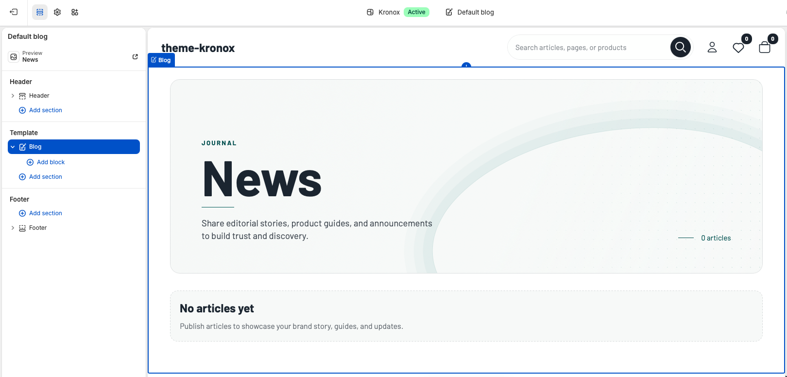
Open the Shopify theme editor and choose a blog from the page selector. The default blog template uses
one reusable Blog section and reads articles from the active Shopify blog.
Template structure:templates/blog.json contains a single
Blog section named main. The section uses the live blog object,
so merchants do not need to select a blog, article, image, or collection manually.
Template
Blog template
The default blog template should remain focused on editorial browsing. Keep the Blog section at the top of
the template because it contains the blog title, summary count, article list, and pagination. Additional
reusable sections can be added below it when a merchant needs newsletter signup, featured collections, or
promotional content after the article list.
Current blog data
The page title comes from blog.title. Article cards, the highlighted article, article
count, tag links, dates, authors, excerpts, and pagination all use Shopify blog and article objects.
OS 2.0 behavior
Because the page is a JSON template, merchants can reorder or add supporting sections around the
main Blog section without editing Liquid. The main section also supports app blocks.
Section settings
Blog section
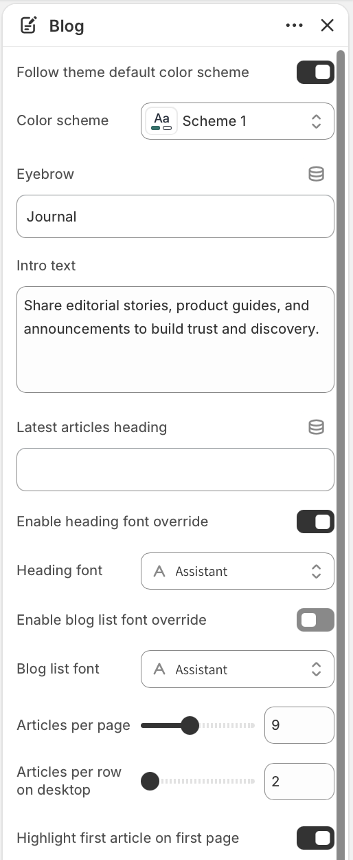
Blog section settings control the visual style, hero text, typography, article density, desktop grid columns,
image crop, metadata, excerpts, CTA text, and empty-state copy. Leave optional text settings blank when the
translated default labels should be used.
Color scheme
Keep Follow theme default color scheme enabled for a storewide look. Select a
specific Color scheme only when the blog needs a dedicated editorial palette.
Hero content
Eyebrow appears above the blog title, and Intro text appears
below it. The title itself always uses the current Shopify blog title.
Typography
Use Enable heading font override for the hero and section headings. Use
Enable blog list font override for featured cards, article cards, pagination,
and empty states.
The first settings group controls the blog page palette, hero copy, latest articles heading, optional
typography overrides, pagination size, desktop row density, and the featured article toggle.
Editorial lead
Featured article
Enable Highlight first article on first page to turn the newest article on page one into a
large editorial card. The featured card uses the article image, title, excerpt, metadata, and CTA, then the
remaining articles continue in the grid below.
Featured label
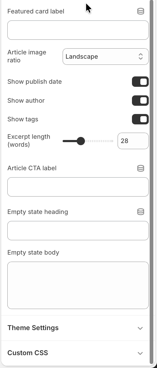
Featured card label customizes the small editorial label. When left blank, the
section uses the translated featured article label from the theme locale files.
First page only
The highlighted card appears only on page one. Paginated pages show the standard article grid so
customers can continue browsing without repeated lead content.
Article browsing
Article list
Article cards are designed for scanning. They include a linked image, title, optional date and author,
optional tag links, excerpt, and a compact article CTA. The grid adapts from one column on small screens to
a wider editorial layout on desktop.
Articles per page
Articles per page controls Shopify pagination from 4 to 16 articles. Use a
lower value for image-heavy journals and a higher value for announcement-heavy blogs.
Articles per row
Articles per row on desktop controls the desktop grid from 2 to 4 columns. The
section keeps mobile layouts readable and also adjusts image loading sizes to match the selected
desktop density.
Image ratio
Article image ratio supports Adapt to image,
Landscape, and Square. Landscape is the default and works well
for most editorial thumbnails.
Metadata
Use Show publish date, Show author, and
Show tags to decide how much article context appears on listing cards. Tag links
point to the current blog's tagged URL.
Excerpts and CTA
Excerpt length trims article excerpts or content from 12 to 60 words.
Article CTA label overrides the translated read-article text when a merchant
wants a custom call to action.
Listing settings control article density, the featured card, image crops, metadata visibility, excerpt
length, CTA labels, and empty-state messages.
States and extensibility
States and apps
Empty blog
If the blog has no articles, the section renders an empty state instead of an article grid. Merchants
can customize Empty state heading and Empty state body, or leave
them blank to use translated defaults.
Pagination
When the blog has more articles than the configured page size, Shopify's default pagination appears
below the grid with a localized navigation label.
App blocks
The Blog section accepts app blocks. Use them for editorial integrations that belong inside the blog
listing flow, such as review widgets, loyalty banners, or content tools.
Quality check
Checklist
Test the blog with no articles, one article, and enough articles to trigger pagination.
Confirm featured article behavior appears only on the first page when enabled.
Check cards with missing article images; placeholder media should keep the grid stable.
Test long titles, long tag names, and translated CTA labels on mobile.
Verify author, date, and tag visibility settings match the merchant's editorial strategy.
Confirm all article titles, images, tags, CTA buttons, and pagination links are keyboard reachable.
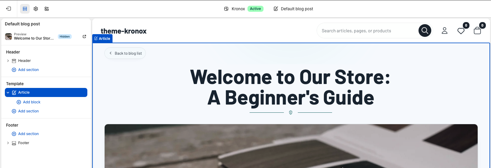
Blog
The Blog documentation covers the individual article page. This template turns Shopify article data into a
polished reading experience with a back-to-blog link, article title, featured image, rich text content,
author and publish date metadata, tags, comments, related articles, app blocks, and configurable typography.
Open the Shopify theme editor and choose an article from the page selector. The default article template
uses one reusable Article section that reads the active Shopify article and blog objects.
Template structure:templates/article.json contains a single
Article section named main. The section does not require merchants to select
a specific article manually; it uses the currently viewed article, its parent blog, comments, tags, image,
content, and neighboring blog articles.
Template
Article template
The article template should stay focused on reading. Keep the Article section first because it contains the
article title, media, body content, comments, and related story discovery. Merchants can add supporting
sections below it if they need a newsletter signup, featured products, or campaign content after the article.
Live article data
The page renders article.title, article.image,
article.content, article.author, article.published_at,
article.tags, and article.comments. Related cards are pulled from
blog.articles while skipping the current article.
OS 2.0 editing
The JSON template keeps the page compatible with Shopify Online Store 2.0 section editing. The main
Article section also supports app blocks for article-level integrations.
Section settings
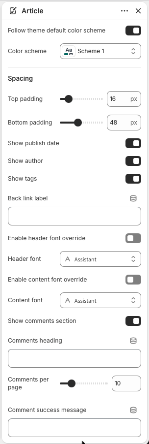
Article section
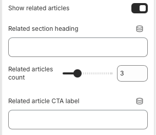
Article settings control the page palette, spacing, visible metadata, back link label, typography, comments,
related articles, and translated fallback labels. Most settings are optional and can be left blank to use
the theme's locale strings.
Color scheme
Keep Follow theme default color scheme enabled when article pages should inherit
the storewide palette. Choose a dedicated Color scheme when editorial pages need
a more distinct reading surface.
Spacing
Top padding and Bottom padding control the vertical breathing
room around the article section. Defaults keep the article close to the header while leaving room
after comments and related articles.
Metadata
Show publish date, Show author, and
Show tags decide which article details appear below the content. Tag links route
customers back to the parent blog's tagged view.
Back link
Back link label customizes the pill-shaped link above the title. When blank, the
section uses the translated back-to-blog label.
Typography
Use Enable header font override for the back link and article title. Use
Enable content font override for article body, metadata, comments, related cards,
and app blocks.
The first settings group controls page styling, spacing, metadata visibility, the back link label, and
typography overrides.
Reading experience
Header and content
The article layout starts with a compact back-to-blog link, then centers the article title with a decorative
divider. If the article has a featured image, it appears as a wide responsive image before the article body.
The body renders Shopify rich text directly, so headings, paragraphs, images, lists, and embedded content
should be authored cleanly in Shopify admin.
Featured image
The image uses Shopify image filters with responsive widths and eager loading because it is near the
top of the article. If no article image exists, the layout simply continues into the content without a
blank media frame.
Article content
Article body content is wrapped in the theme's rte styling. The first paragraph receives
editorial treatment on larger screens, while mobile removes the drop-cap effect for easier reading.
Tags
Tags appear as small linked chips when enabled and when the article has tags. Use tags for topic
browsing such as buying guides, care tips, releases, interviews, or announcements.
Community
Comments
The comments area appears only when Show comments section is enabled and Shopify blog
comments are enabled for the parent blog. This prevents an empty comment form from appearing on stores that
do not use blog comments.
Comments heading
Comments heading overrides the translated comments title. The rendered heading
includes the live comment count when comments exist.
Pagination
Comments per page controls comment pagination from 5 to 30 comments. Pagination
links include the comments anchor so customers return to the comment area after changing pages.
Comment form
The form includes required name, email, and body fields with proper labels and browser
autocomplete. Comment success message can be customized, or left blank to use
the translated moderated or unmoderated success message.
The lower settings group controls comments, comment pagination, success messaging, related articles,
related article count, and related card CTA text.
Discovery
Related articles
Related articles help readers continue browsing the blog after finishing the current post. The section uses
other articles from the same blog, skips the current article, and displays image, title, excerpt, and CTA
for each related card.
Visibility
Show related articles controls whether the related story grid appears. The section
also checks that the blog has more than one article before rendering related content.
Heading and count
Related section heading overrides the translated heading. Related articles
count controls how many related cards appear, from 2 to 6.
CTA label
Related article CTA label customizes the read-more text on related cards. Keep it
short so it stays tidy across translated storefronts.
App blocks
App blocks render between article metadata and comments. Use them for integrations that belong to the
article itself, such as ratings, loyalty widgets, editorial badges, or content tools.
Quality check
Checklist
Test articles with and without featured images.
Check long article titles, long tag names, and translated back link or CTA labels on mobile.
Confirm author, publish date, and tags hide cleanly when disabled.
Enable and disable Shopify blog comments to confirm the comments section appears only when valid.
Submit a test comment and verify success or moderation messaging.
Test related articles with one article in the blog and with enough articles to fill the configured count.
Verify links, comment fields, pagination, tags, app blocks, and related article cards are keyboard reachable.
Pages
Static pages can be prepared with rich text content and flexible section composition, so merchants can build
store policies, brand pages, guides, and other reusable page layouts.
Page template
About page
The About page uses the page.about template and the About story section.
It is designed for brand storytelling: a hero introduction, supporting page content, value cards, a
milestone timeline, a founder-style quote, and a final call to action. Merchants can edit the page copy in
Shopify admin and fine-tune the full storefront layout from the theme editor.
Open the page selector in the theme editor and choose Pages > About. The template
contains one main section named About story.
Template structure
The default page.about.json template contains a single About story section with four
Value blocks and five Milestone blocks. The blocks can be reordered,
edited, or removed in the theme editor. The section also supports fallback theme text, so the page still
previews cleanly before a merchant finishes every field.
Assign the template
In Shopify admin, create or open an About page and assign the about theme
template. Add the long-form brand story in the page content area when the section setting
Show page content should display it beneath the intro text.
Edit the section
Select About story in the Template area. Use the global color scheme option when
the page should inherit the storewide palette, or choose a dedicated color scheme for a more
editorial brand page.
Set the page width
Use Content max width to control how wide the page can stretch on large screens.
The default is 1640px, which gives the hero and timeline enough room without making text lines too
long.
The About story section contains the main section settings first, followed by editable Value and
Milestone blocks.
Intro content
Set the Eyebrow, Heading, and rich text Text
fields to introduce the brand. Leave the heading blank only when the page title should act as the
main heading.
Page content
Enable Show page content to display the Shopify page body inside the hero area.
This is useful when merchants prefer editing long narrative copy from the Pages admin instead of
inside section settings.
Hero button
Add a Button label and Button link when the intro should lead
customers to collections, featured products, a journal page, or a contact page. The button is
hidden until both fields are filled.
Intro fields control the top copy. The page content toggle pulls in the body text from the Shopify
page assigned to this template.
Brand imagery
Add a Primary image for the hero media and a Secondary image
for the journey area. Use images with clear subjects and similar visual tone so the page feels
intentional across desktop and mobile layouts.
Journey and quote
Set the Journey heading, Quote text, and
Quote author to connect the timeline with a human brand voice. If these fields
are blank, localized default copy is used.
Call to action
Use the CTA image, heading, text, and up to two buttons to send customers to the next step after
they read the brand story. Common destinations are a collection list, a featured collection, or
the contact page.
Media, journey, quote, and CTA settings complete the lower parts of the About page.
Value blocks
Value blocks create the compact cards below the hero. Use them for brand promises such as quality,
responsible materials, delivery, design, service, or warranty. The section supports up to four Value blocks,
each with an icon, heading, and short text.
Each Value block controls one card. Choose an icon, then keep the heading and text short enough to scan
quickly on mobile.
Select a Value block inside the About story section.
Choose an icon: Quality, Leaf, Delivery, Globe, or Star.
Add a concise heading that names the promise.
Add one short sentence explaining why the value matters to customers.
Drag blocks into the order customers should read them.
Milestone blocks
Milestone blocks build the timeline in the journey area. Use them for founding moments, product launches,
global expansion, sustainability changes, store openings, community initiatives, or other proof points that
help customers understand the brand's progression.
Each Milestone block includes a label, heading, and supporting text. The label is usually a year, but it
can also be a short era or campaign name.
Select a Milestone block inside the About story section.
Use Label for a year, season, launch name, or short date marker.
Add a heading that summarizes the milestone.
Add a short text field with the customer-relevant context.
Keep the timeline chronological unless a campaign story needs another order.
Best practice: Treat the About page as a trust page, not only a biography. Lead with the
brand's reason to exist, show a few concrete values, use real imagery when possible, and finish with a clear
next step.
Page template
Contact page
The storefront Contact page uses the page.contact template. This is different from the
documentation support form linked in the header. The storefront template is built for customer contact,
store details, and social channels inside Shopify, while the documentation contact form is only for public
Kronox theme support.
Open the page selector in the theme editor and choose Pages > Contact. The template
includes the main Contact page section followed by Contact social links.
Template structure
The default page.contact.json template contains two sections. The first section,
Contact page, renders the page heading, optional page body, Shopify contact form, and
contact details sidebar. The second section, Contact social links, renders brand social
links from Shopify brand settings and optional manual social network blocks.
Assign the template
In Shopify admin, create or open the customer-facing Contact page and assign the
contact theme template. Add any intro copy in the page content field when the
page should show a short note above the form and contact details.
Section style
Use Follow global theme color scheme when the page should inherit storewide
colors. Disable it and choose Color scheme when the contact area needs its own
background and surface treatment.
Layout width and spacing
Use Content max width to control the full page width. Adjust top and bottom
padding to place the form comfortably between the header, social links, and footer.
The Contact page section controls the main storefront contact layout, including page width, heading,
form visibility, and sidebar details.
Heading and page content
Set Contact page heading when the storefront heading should be different from the
Shopify page title. If the Shopify page has body content, the section displays it under the
heading as introductory copy.
Contact form
Keep Enable contact form turned on when customers should be able to send a
message through Shopify's built-in contact form. The form includes name, required email, optional
phone, and required message fields.
Phone field
Use Show phone field when phone follow-up is useful for the store. Disable it for
simpler support workflows where email-only contact is preferred.
Form settings control the customer message form. Sidebar fields add the visible store contact details
beside it.
Contact details sidebar
The sidebar is shown when at least one contact detail is filled in. Use
Response heading and Response text to set expectations, then add email,
phone, location, and working hours as needed. Email and phone values become clickable links on the
storefront, while location and working hours support multiple lines.
Set a clear response heading, such as We are here to help.
Add a short response text that explains when customers should expect a reply.
Add the customer-facing support email and phone number.
Add store location and working hours only when they are useful for the business.
Preview the page on mobile to make sure the sidebar and form stack cleanly.
Contact social links
The Contact social links section helps customers continue the conversation on social channels. It can pull
links from Shopify brand settings, render manual social network blocks, or combine both. Social cards are
rendered with the contact-social-card snippet, which shows the platform icon, label,
optional handle, and a link arrow.
Use brand social links for storewide channels, or add Social network blocks when the contact page needs
specific labels, handles, links, or new-tab behavior.
Brand social links
Enable Show Shopify brand social links to use social URLs configured in Shopify
brand settings. The section supports common platforms including Instagram, Facebook, X, LinkedIn,
Pinterest, TikTok, YouTube, Snapchat, Tumblr, and Vimeo.
Manual blocks
Add Social network blocks for page-specific channels or custom labels. Each block has
a platform, label, handle, link, and Open in new tab option.
Brand fallback
Enable Use Shopify brand link when a manual block link is blank when manual blocks
should inherit the matching brand social URL. This is helpful when merchants want custom labels or
handles without re-entering every link.
Best practice: Keep the storefront Contact page customer-focused. Use the Shopify contact
form for order, product, and store questions; keep the documentation support form separate for theme support
requests.
Page template
FAQ page
The FAQ page uses the page.faq template and one main FAQ section. It is
built for customer self-service: a clear help-center hero, category buttons, filtered question accordions,
and an optional support card for customers who still need help.
Open the page selector in the theme editor and choose Pages > FAQ. The template
contains the FAQ section with category and question blocks.
Template structure
The default page.faq.json template includes six Category blocks and seven Question blocks.
Category blocks create the filter buttons across the page, while Question blocks create the accordion items.
Each question is connected to a category by its Category setting, so customers can filter
answers by topic.
Assign the template
In Shopify admin, create or open the FAQ page and assign the faq theme template.
Use the Shopify page body only when the FAQ section setting should pull page content into the
hero.
Section style
Keep Follow global theme color scheme enabled when the FAQ page should inherit
the storewide palette. Use Color scheme, Content max width, and
Corner radius to tune the full FAQ layout.
Spacing
Adjust top and bottom padding when the FAQ page needs more room below the header or above the
footer. Keep spacing moderate so customers can reach the questions quickly.
The FAQ section settings control the overall page. Category and Question blocks build the customer
help content.
Hero content
Use Eyebrow, Heading, and rich text Text to
introduce the page. If the Text field is blank, enabling Show page content when intro text
is blank lets the section display the Shopify page body instead.
Hero image
Add a Hero image when the FAQ page needs a warmer service or product-care
visual. If no image is selected, the hero remains text-first and the page still works cleanly.
Support card
Enable Show support card to display help copy, email, phone, hours, and a CTA
button below the FAQ list. This is useful when customers may need order-specific support.
Hero settings introduce the page. Support settings create the final help card below the accordion
list.
Category blocks
Category blocks create the filter buttons customers use to switch between FAQ topics. The section supports
up to eight categories, including Orders, Shipping, Returns, Product care, Warranty, Payments, Custom 1, and
Custom 2. A category only becomes useful when one or more Question blocks use the same category connection.
Configure each Category block with a category connection, icon, and customer-facing label.
Select a Category block inside the FAQ section.
Choose the Category connection. This key controls which questions appear when selected.
Choose an icon that matches the topic.
Add a short label, such as Orders, Shipping, Returns, Care, or Payments.
Remove unused categories or add custom categories when the store needs a specific support topic.
Question blocks
Question blocks create the accordion rows inside the FAQ list. Each block has a category, question, rich text
answer, and an Open by default option. When customers choose a category, the section hides
questions from other categories and opens the first visible item.
Connect every Question block to the right category so filtering works predictably on the storefront.
Select a Question block inside the FAQ section.
Choose the category where the question should appear.
Write the question in customer language, not internal policy language.
Add a concise rich text answer with links to policy, contact, or product-care pages when useful.
Use Open by default only for the most important answers in a category.
Best practice: Keep the FAQ page task-focused. Group questions by the customer's problem,
avoid long legal copy in accordion answers, and route unresolved questions to the Contact page through the
support card.
Policy page
The policy page uses the page.policy template and the Policy tabs
section. It gives merchants a single, scannable place for returns, shipping, privacy, terms, warranty, and
other policy content without hardcoding store-specific text.
Open the page selector in the theme editor and choose the policy page. The template contains one main
section named Policy tabs with four starter Policy blocks.
Page template
Assign the policy template
Create the page
In Shopify admin, create a page for store policies and assign the policy theme
template. The template is section-based, so merchants can keep the page flexible while the Policy tabs
section handles the structured policy layout.
Use page content
Add broad introductory copy in the Shopify page content area when the section setting
Show page content when intro text is blank is enabled. This keeps longer policy
introductions editable from the Pages admin.
Adjust blocks
The default template includes Returns, Shipping, Privacy, and Terms blocks. Merchants can edit,
remove, duplicate, or reorder these blocks from the theme editor.
Policy tabs section
Configure the page shell
Select Policy tabs in the Template area to control the page wrapper, hero content, spacing,
and support area. These settings affect every policy tab on the page.
Color and width
Enable Use global color scheme when the policy page should inherit the storewide
palette. Disable it to choose a dedicated color scheme. Use Content max width to
control the maximum layout width on large screens.
Shape and spacing
Corner radius, Top padding, and
Bottom padding tune the page rhythm. The defaults create a roomy documentation
style that still works on mobile.
Hero content
Set the Eyebrow, Heading, and rich text Text
fields for the top introduction. If the section heading is blank, the page title is used as the
main heading.
The section settings define the overall page shell and the hero copy above the tabs.
Policy blocks
Build each policy tab
Each Policy block becomes one tab and one matching content panel. The section supports up
to eight policy blocks, which is enough for common store policies without making the tab bar hard to scan.
Tab identity
Choose an Icon for the tab, then set the Tab title and
Tab description. Available icon styles include returns, shipping, privacy, terms,
and lock.
Main content
Use Main heading and Main text for the policy overview. Keep
the first paragraph short so customers can understand the policy before reading the detailed
cards.
Highlight cards
Add two highlight cards for the most important requirements, such as return windows, packaging
rules, shipping timelines, data usage, or warranty exclusions.
The first part of a Policy block controls the tab label, overview copy, and two compact highlight
cards.
Step timeline
Enable Show steps to display a four-step process. Each step has a heading, text,
and icon. Use this area for workflows like request, review, approval, and resolution.
Step icons
Step icon choices are Mail, Review, Check, and Refund. Pick icons that match the customer action,
not just the policy category, so the process is easier to scan.
Optional fields
Blank step headings or text are skipped. This lets merchants use fewer than four visible steps
when a policy needs a simpler flow.
Steps are useful for returns, warranty claims, delivery exceptions, or account requests.
Comparison cards
Enable Show comparison cards to show a positive and negative card. This pattern
works well for included versus not included, eligible versus not eligible, or available versus
restricted details.
Rich text lists
Use the positive and negative rich text fields for short bullet lists. Keep each bullet specific
so customers do not need to contact support for basic eligibility questions.
Clear labels
Use direct headings such as Included, Not included, Eligible, Not eligible, Covered, or Excluded.
The comparison card styling handles the visual distinction.
Comparison cards help customers understand policy boundaries without reading a long paragraph.
Negative card text
The final rich text field completes the negative comparison card. Use concise bullets for
exclusions, restricted cases, or policy limits.
The negative card supports rich text, including links and lists when merchants need legal or support
references.
Support card
Add customer support details
The optional support card appears below the policy panels. Use it for direct help channels when customers
still need a human answer after reading the policies.
Visibility
Toggle Show support card on when the policy page should include a final contact
area. Turn it off for stores that route all service requests through a separate contact page.
Contact methods
Add support email, phone, and hours. Email and phone render as customer-friendly links, while
support hours appear as plain text.
Support action
Add a Support button label and Support button link to send
customers to a contact page, help center, returns portal, or order lookup page.
The support card is optional and only shows populated contact details.
Best practices
Keep the policy page clear
Write for scanning
Put the most important promise or limitation in the tab description, then use the panel for details.
Customers should understand the policy shape before opening every card.
Keep policies reusable
Avoid campaign-specific copy in this page. Use it for long-lived operational information such as
returns, shipping, privacy, service terms, warranties, repairs, subscriptions, or store pickup.
Check mobile tabs
On small screens, the tab list becomes horizontally scrollable and each active panel stacks into a
single column. Review long tab titles and comparison lists on mobile before publishing.
Custom code
Custom coding tutorials are provided as educational guidance only unless a support response explicitly says
otherwise. Always duplicate your theme before editing code. For production customizations, consider hiring a
qualified Shopify Partner.
We are a Shopify Partner, and you can
contact us through the support form if you need help with custom code.
Code changes can affect theme updates. Support covers bug fixes and theme usage questions; custom
development, app integrations, and store-specific design work are handled as separate services.
Support policy
Kronox support includes theme bug fixes, setup guidance for built-in theme features, and answers to merchant
questions about documented settings. Support does not include custom coding, third-party app configuration,
store data entry, or custom design implementation.
Support requests are reviewed using the details submitted through the contact form. Include your
store URL, screenshots when possible, and clear steps to reproduce the issue.
FAQ
How do I update Kronox safely?
Duplicate your live theme, apply the update to the copy, review key templates, then publish when testing is complete.
Can I use custom metafields?
Yes. Use Shopify metafields and dynamic sources where the theme editor exposes compatible settings.
Why are filters not showing on collection pages?
Enable filters in Shopify Search & Discovery and confirm the collection has products matching the filter values.
Are third-party apps supported?
The theme is built for Shopify best practices, but app behavior is controlled by the app provider. Contact the app developer for app-specific issues.