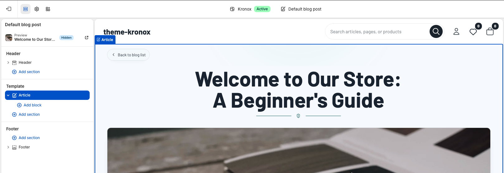
The Blog documentation covers the individual article page. This template turns Shopify article data into a
polished reading experience with a back-to-blog link, article title, featured image, rich text content,
author and publish date metadata, tags, comments, related articles, app blocks, and configurable typography.
Open the Shopify theme editor and choose an article from the page selector. The default article template
uses one reusable Article section that reads the active Shopify article and blog objects.
Template structure:templates/article.json contains a single
Article section named main. The section does not require merchants to select
a specific article manually; it uses the currently viewed article, its parent blog, comments, tags, image,
content, and neighboring blog articles.
Template
Article template
The article template should stay focused on reading. Keep the Article section first because it contains the
article title, media, body content, comments, and related story discovery. Merchants can add supporting
sections below it if they need a newsletter signup, featured products, or campaign content after the article.
Live article data
The page renders article.title, article.image,
article.content, article.author, article.published_at,
article.tags, and article.comments. Related cards are pulled from
blog.articles while skipping the current article.
OS 2.0 editing
The JSON template keeps the page compatible with Shopify Online Store 2.0 section editing. The main
Article section also supports app blocks for article-level integrations.
Section settings
Article section
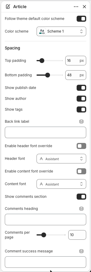
Article settings control the page palette, spacing, visible metadata, back link label, typography, comments,
related articles, and translated fallback labels. Most settings are optional and can be left blank to use
the theme's locale strings.
Color scheme
Keep Follow theme default color scheme enabled when article pages should inherit
the storewide palette. Choose a dedicated Color scheme when editorial pages need
a more distinct reading surface.
Spacing
Top padding and Bottom padding control the vertical breathing
room around the article section. Defaults keep the article close to the header while leaving room
after comments and related articles.
Metadata
Show publish date, Show author, and
Show tags decide which article details appear below the content. Tag links route
customers back to the parent blog's tagged view.
Back link
Back link label customizes the pill-shaped link above the title. When blank, the
section uses the translated back-to-blog label.
Typography
Use Enable header font override for the back link and article title. Use
Enable content font override for article body, metadata, comments, related cards,
and app blocks.
The first settings group controls page styling, spacing, metadata visibility, the back link label, and
typography overrides.
Reading experience
Header and content
The article layout starts with a compact back-to-blog link, then centers the article title with a decorative
divider. If the article has a featured image, it appears as a wide responsive image before the article body.
The body renders Shopify rich text directly, so headings, paragraphs, images, lists, and embedded content
should be authored cleanly in Shopify admin.
Featured image
The image uses Shopify image filters with responsive widths and eager loading because it is near the
top of the article. If no article image exists, the layout simply continues into the content without a
blank media frame.
Article content
Article body content is wrapped in the theme's rte styling. The first paragraph receives
editorial treatment on larger screens, while mobile removes the drop-cap effect for easier reading.
Tags
Tags appear as small linked chips when enabled and when the article has tags. Use tags for topic
browsing such as buying guides, care tips, releases, interviews, or announcements.
Community
Comments
The comments area appears only when Show comments section is enabled and Shopify blog
comments are enabled for the parent blog. This prevents an empty comment form from appearing on stores that
do not use blog comments.
Comments heading
Comments heading overrides the translated comments title. The rendered heading
includes the live comment count when comments exist.
Pagination
Comments per page controls comment pagination from 5 to 30 comments. Pagination
links include the comments anchor so customers return to the comment area after changing pages.
Comment form
The form includes required name, email, and body fields with proper labels and browser
autocomplete. Comment success message can be customized, or left blank to use
the translated moderated or unmoderated success message.
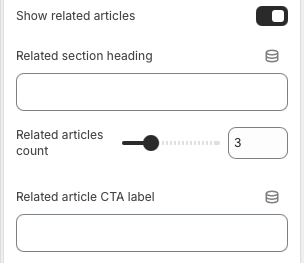
The lower settings group controls comments, comment pagination, success messaging, related articles,
related article count, and related card CTA text.
Discovery
Related articles
Related articles help readers continue browsing the blog after finishing the current post. The section uses
other articles from the same blog, skips the current article, and displays image, title, excerpt, and CTA
for each related card.
Visibility
Show related articles controls whether the related story grid appears. The section
also checks that the blog has more than one article before rendering related content.
Heading and count
Related section heading overrides the translated heading. Related articles
count controls how many related cards appear, from 2 to 6.
CTA label
Related article CTA label customizes the read-more text on related cards. Keep it
short so it stays tidy across translated storefronts.
App blocks
App blocks render between article metadata and comments. Use them for integrations that belong to the
article itself, such as ratings, loyalty widgets, editorial badges, or content tools.
Quality check
Checklist
Test articles with and without featured images.
Check long article titles, long tag names, and translated back link or CTA labels on mobile.
Confirm author, publish date, and tags hide cleanly when disabled.
Enable and disable Shopify blog comments to confirm the comments section appears only when valid.
Submit a test comment and verify success or moderation messaging.
Test related articles with one article in the blog and with enough articles to fill the configured count.
Verify links, comment fields, pagination, tags, app blocks, and related article cards are keyboard reachable.