The homepage is built entirely with sections. Merchants can add and reorder hero banners, featured products,
featured collections, rich text, image with text, newsletter, and promotional banner sections.
Homepage section
Home collection links
The Home collection links section creates a horizontal set of visual collection shortcuts near the top of
the homepage. Use it to help customers move quickly into important categories, seasonal edits, brand
campaigns, or any collection that should be easy to discover before they scroll deeper into the page.
Make sure you are editing the active Kronox theme and that the page selector is set to Home page before
changing homepage sections.
Open the Home page template
Open the Shopify theme editor and choose Home page from the page selector. In the Template
area, add or select Home collection links. The section can be reordered with the other
homepage sections, so place it where category discovery makes the most sense for the store.
Home collection links settings
Template position
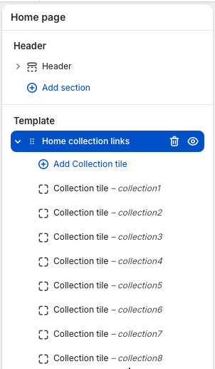
The section lives in the homepage Template area, below the header and above the footer. Add one
block for each collection link you want to show. The screenshot shows multiple
Collection tile blocks under the section, and the number of tiles can be changed
by adding, removing, or reordering blocks.
Use blocks for links
Select Add Collection tile to add another shortcut. Each block controls one
collection selector, which keeps the section flexible for small category menus, campaign rows, or
larger collection groups.
Add Collection tile blocks inside the Home collection links section to build the list.
Section style
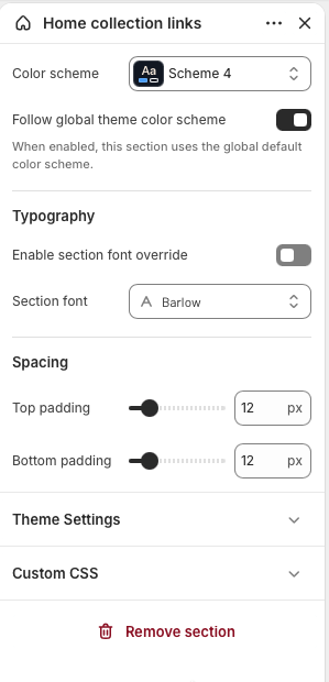
Use Color scheme to match the section to the rest of the page. Enable
Follow global theme color scheme when you want the section to inherit the
storewide default.
Typography and spacing
Turn on the section font override only when this area needs a different font from the global
theme typography. Adjust top and bottom padding to tighten the section or create more breathing
room between neighboring homepage sections.
Section settings control the overall color, typography, and spacing for the collection link row.
Collection tile settings
Collection tile blocks are the individual selectors inside this section. Each tile links to one selected
Shopify collection, so merchants can guide customers to category pages, campaign pages, sale collections, or
curated product lists. When a collection is selected, the tile uses that collection URL and collection image
by default. The image can still be overridden when a campaign, category, or seasonal page needs a custom
visual. Add more tiles when the homepage needs more shortcuts, or remove tiles when the row should stay
focused.
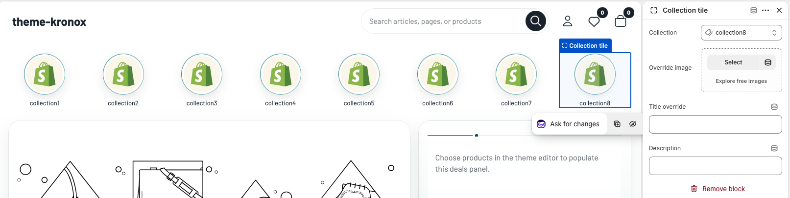
In the preview, each visible tile represents one Collection tile block. The block settings on the right
control which collection the tile links to, plus optional image, title and description overrides.
Select a Collection tile block inside the Home collection links section.
Choose the collection that the tile should link to. The theme uses the selected collection URL and
collection image automatically.
Optional: add an override image when you want the tile to use a campaign image instead of the collection
image.
Optional: add a title override when the storefront label should be shorter, more seasonal, or more
customer-friendly than the collection title.
Optional: add a short description if the design or future layout uses supporting copy for collection
tiles.
Best practice: Keep the row focused. Use the most important collections first, choose
images with similar visual weight, and use short labels so the section stays easy to scan on mobile.
Homepage section
Home hero with deals
The Home hero with deals section combines a large campaign slider with a compact deals list. Use the slider
for seasonal promotions, launches, collection stories, or brand messages, and use the deals panel to feature
discounted products beside the hero without sending customers away from the main homepage path.
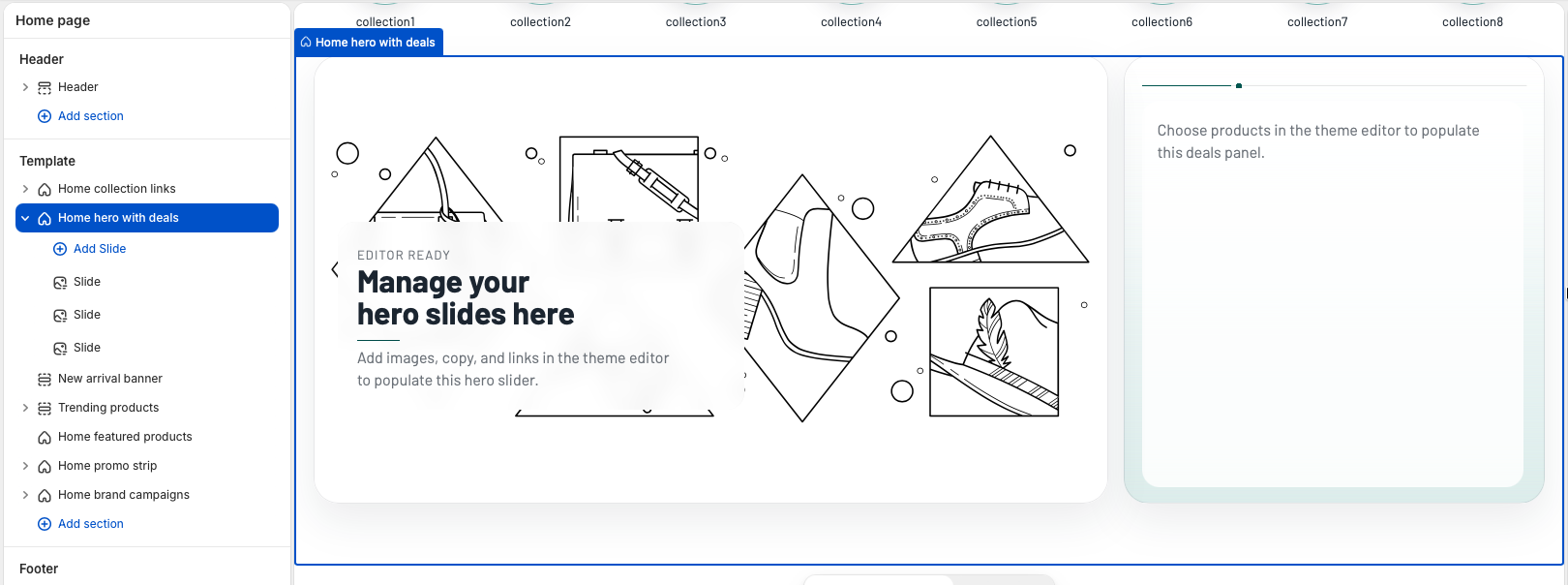
The section displays slide blocks in the large hero area and a product deals list on the right. Add or
reorder Slide blocks to control the slider, and use the section settings to choose which products appear
in the deals panel.
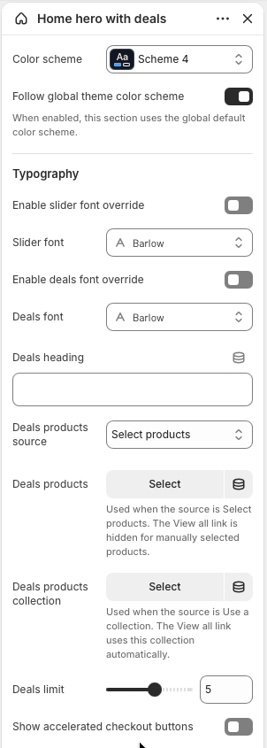
Home hero with deals settings
Template position
Add Home hero with deals to the Home page template and place it near the top of
the page when the store needs a strong campaign entry point. The section supports up to six
Slide blocks, and only slides with an image are displayed on the storefront.
Section style
Use Color scheme to style the hero and deals panel. Keep
Follow global theme color scheme enabled when this section should inherit the
storewide default color scheme.
Typography
The slider and deals panel can use the global homepage font, or each area can use its own font.
Enable Slider font override or Deals font override only when the
campaign content needs a deliberate typography change.
Deals products
Set Deals heading, then choose the Deals products source. Select
individual products for a hand-picked list, or choose a collection when the deals should stay in
sync with a sale, clearance, or campaign collection.
Limit and links
Use Deals limit to show between one and eight products. The
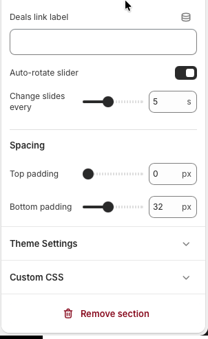
Deals link label appears only when the source is a collection, because the link
automatically points to the selected collection.
Checkout and slider timing
Enable Show accelerated checkout buttons when direct payment buttons should be
available for single-variant products. Use Auto-rotate slider and
Change slides every to control slider movement.
Spacing
Adjust top and bottom padding to control how tightly the hero sits against the header and nearby
homepage sections.
The section is built from Slide blocks. Add more blocks for more slider items, or reorder blocks to
change the slide sequence.
Deals settings choose the products shown in the right panel, while slider settings control autoplay
and slide speed.
Slide block settings
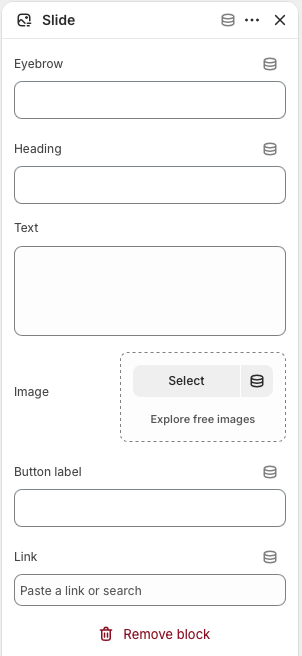
Each Slide block creates one item in the hero slider. A slide needs an image before it appears on the
storefront. Optional text fields create the overlay content, and the link turns the slide into a
clickable promotion.
Select a Slide block inside the Home hero with deals section.
Add an Image. Slides without an image are skipped, so this is the required visual
field for each slider item.
Add an optional Eyebrow, Heading, and Text to
create the overlay message.
Add a Button label and Link when the slide should send customers
to a collection, product, page, or campaign URL.
Repeat with additional Slide blocks, then drag blocks into the order customers should see them.
Best practice: Use slides with similar image crops and visual density, keep slide
copy short, and choose deals products with visible compare-at prices when the section is being used as
a sale or discount feature.
Configure each Slide block with campaign text, a strong image, an optional button label, and a
destination link.
Homepage section
New arrival banner
The New arrival banner section highlights one selected product in a focused promotional banner. Use it for a
recent launch, a restock, a seasonal product, or any item that needs more visual emphasis than a standard
product card.
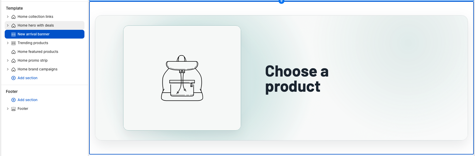
The banner uses the selected product image and product URL, while the text settings control the badge,
heading, description, and button shown beside the product.
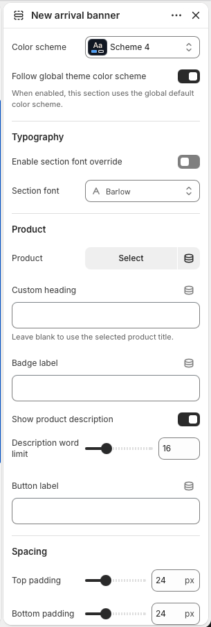
New arrival banner settings
Section style
Use Color scheme to match the banner to the surrounding homepage sections. Keep
Follow global theme color scheme enabled when the banner should inherit the
storewide default colors.
Typography
The banner uses the homepage typography by default. Enable
Section font override and choose a Section font only when this
product feature needs its own type style.
Product
Choose the product to feature. The section links the button to this product and uses the product's
first image, falling back to the featured image when needed. If no product is selected, the
section is only shown in the theme editor as a setup prompt.
Heading and badge
Add a Custom heading when the banner needs campaign copy. Leave it blank to use
the selected product title automatically. Use Badge label for short text such as
New arrival, Restocked, Limited drop, or Online exclusive.
Description
Enable Show product description to display a shortened version of the selected
product description. Use Description word limit to keep the banner concise and
balanced across desktop and mobile layouts.
Button and spacing
Set Button label for the product link text. Adjust top and bottom padding to
control how much space the banner has between neighboring homepage sections.
Select one product, then refine the text, description length, button label, color scheme, typography,
and spacing from the section settings.
Best practice: Choose a product with a clean primary image and keep the custom heading
short. This section works best when it promotes one clear product story instead of trying to explain a full
collection.
Homepage section
Trending products
The Trending products section creates a focused product feature with promotional copy on one side and a
small set of selected products on the other. Use it for best sellers, high-interest launches, seasonal
picks, or any curated group that should receive stronger emphasis than a standard product grid.
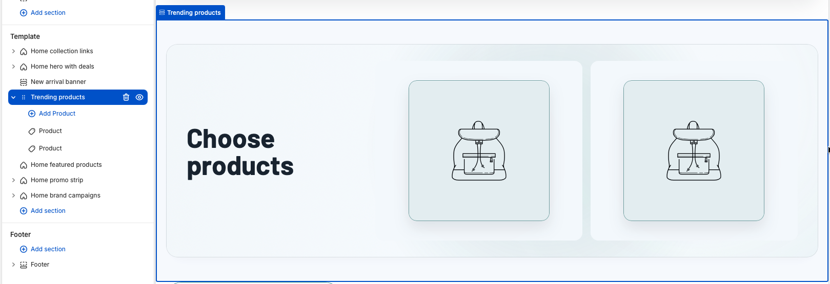
The section combines merchant-entered marketing content with Product blocks. Each selected product block
displays as a clickable product image, while the main button can link to the first product or to a custom
destination.
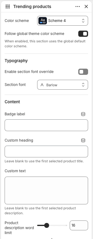
Trending products settings
Section style
Use Color scheme to align the panel with the rest of the homepage. Keep
Follow global theme color scheme enabled when the section should use the
storewide default colors.
Typography
The section inherits homepage typography by default. Enable
Section font override and choose a Section font only when this
featured product group needs a distinct type treatment.
Content
Set the Badge label, Custom heading, and
Custom text for the promotional copy. If the heading or text is left blank, the
theme uses the first selected product title and description as fallback content.
Description length
Use Product description word limit to control fallback text length when Custom
text is empty. This keeps product descriptions from becoming too long inside the banner layout.
Button
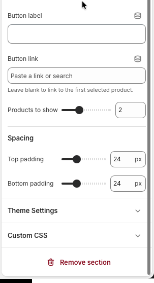
Set Button label for the call to action. Add a Button link when
the button should go to a collection, campaign page, or another destination. Leave it blank to
link automatically to the first selected product.
Product count
Use Products to show to display between one and four product blocks. The desktop
layout adapts the product columns to the selected count, while smaller screens collapse into a
mobile-friendly layout.
Product blocks
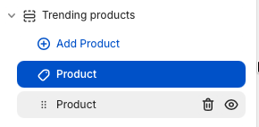
Add one Product block for each item in the curated set. The section supports up
to four blocks. Each block links to its selected product and uses the product featured image,
falling back to the first product image when needed.
Spacing
Adjust top and bottom padding to control the distance between this feature and neighboring
homepage sections.
Section settings control the panel style, marketing copy, fallback description length, call to
action, product count, and spacing.
Product blocks define the exact products shown in the visual product area. Add, remove, and reorder
blocks to change the curated product set.
Select products
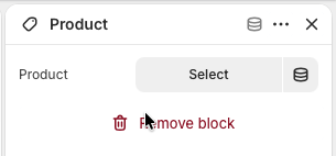
Product selection happens inside each Product block, not in the main section
settings. Add a Product block, open the block settings, and use the product selector to choose the
exact item that should appear in the Trending products visual area.
In the Trending products section, select an existing Product block or add a new
one.
Click the Product picker in the block settings.
Search for the product, select it from the picker, and confirm the selection.
Repeat for each Product block, then reorder the blocks if the products should appear in a different
sequence.
Tip: Match the number of selected Product blocks with the
Products to show setting. If Products to show is lower than the number of blocks, the
extra blocks remain configured but are not displayed.
Open a Product block and click the product picker to choose the item for that block.
After a product is selected, the block controls that product image and link in the storefront
layout.
Best practice: Keep the product group tightly curated. Two to four related products usually
work best, especially when the heading and button describe one clear buying path.
Homepage section
Home featured products
The Home featured products section displays products from one selected collection in a clean product grid.
Use it for popular products, best sellers, new edits, seasonal collections, or any collection that should be
easy to browse directly from the homepage.
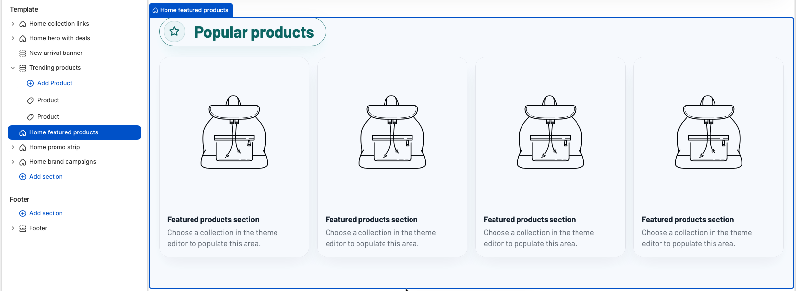
The section uses one horizontal product row on desktop. When no collection is selected, placeholder cards
appear in the theme editor so merchants can still understand the layout before choosing products.
Home featured products settings
Section style
Use Color scheme to style the section. Keep
Follow global theme color scheme enabled when this product row should inherit the
storewide default colors.
Typography
The section inherits homepage typography by default. Enable
Section font override and choose a Section font only when this
product row needs its own heading and card text style.
Header content
Set Heading for the title shown above the grid. Add optional
Text when the row needs a short collection note, and use
Link label for the header call to action. The link automatically points to the
selected collection page.
Collection
Choose the Collection that supplies the product cards. The section shows products
from this collection in collection order until the product limit is reached.
Product count
Use Products limit to show between four and twelve products from the selected
collection. The section shows products in collection order until the limit is reached.
Desktop columns
Use Products per row on desktop to choose three, four, or five columns. Mobile
keeps the grid compact with two columns, while tablet screens use three columns.
Product card options
Enable Show vendor when brand or vendor names help customers compare products.
Enable Show secondary image to reveal another product image in cards that have
more than one image.
Buying actions
Use Enable quick add for faster cart additions from the product cards. Use
Enable quick buy when direct checkout buttons should appear for eligible
products.
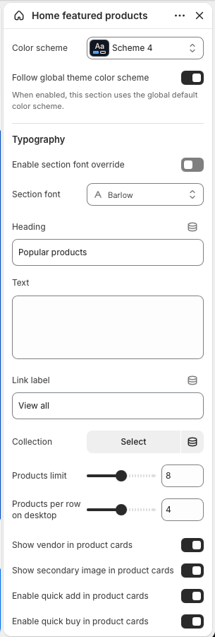
The main settings select the collection, control the row title and link, set the product limit, and
choose how many product cards appear per desktop row.
Spacing settings adjust the vertical room above and below the product row.
Set up the section
Add Home featured products to the Home page template.
Choose the collection whose products should appear in the row.
Edit the heading, optional text, and link label so the section clearly describes the collection.
Set the product limit and desktop column count based on how much space the section should occupy.
Review vendor, secondary image, quick add, and quick buy settings to match the store's buying flow.
Best practice: Select a collection with strong product images and keep the heading short.
Four products with four desktop columns works well for a single horizontal row, while higher limits create
a deeper browse area for larger collections.
Homepage section
Home promo strip
The Home promo strip section creates a row of short promotional discount boxes. Use it for sale messages,
category-specific discounts, loyalty offers, shipping incentives, or quick campaign links that should sit
between larger homepage sections.
On desktop, the strip displays discount boxes in one horizontal row. The section is block-based, so each
visible box comes from one Discount box block.
Home promo strip settings
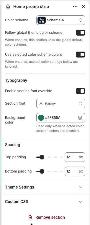
Section style
Use Color scheme to align the strip with the homepage. Keep
Follow global theme color scheme enabled when the section should inherit the
storewide default color scheme.
Color source
Enable Use selected color scheme colors when the strip should use theme color
tokens. Disable it only when the section needs the manual Background color
setting instead.
Typography
The strip uses homepage typography by default. Enable Section font override and
choose a Section font when the discount values and labels need their own type
style.
Manual background
Background color is used only when
Use selected color scheme colors is disabled. This lets a merchant create a
campaign-specific band without changing the global theme color scheme.
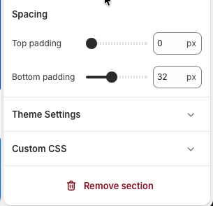
Spacing
Adjust Top padding and Bottom padding to control how tightly
the promo row sits between neighboring homepage sections. The default compact spacing works well
for a strip between product rows or campaign banners.
Section settings control the strip colors, font, optional manual background, and vertical spacing.
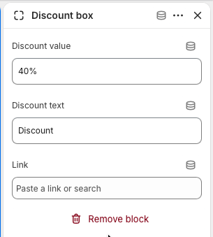
Discount box blocks
Discount value
Use Discount value for the large headline number or offer text, such as
40%, Free, or 2+1. Keep it short so the card
remains balanced across desktop and mobile.
Discount text
Use Discount text for the short label below the value, such as Discount, Off
selected items, Free shipping, or Members only.
Link
Add a Link when the discount box should open a collection, product, page, or
campaign URL. If the link is blank, the box displays as a non-clickable promotional message.
Block display
A block appears when either Discount value or Discount text has
content. Empty blocks are skipped on the storefront, and the section shows an editor-only empty
message when no valid blocks exist.
Each Discount box block controls one promo card. Add, remove, and reorder blocks to change the strip
content.
Set up the section
Add Home promo strip to the Home page template.
Add one Discount box block for each offer you want to show.
Enter the discount value and short supporting text for each block.
Add links to boxes that should send customers to a promotion, collection, or product page.
Adjust color, typography, and spacing so the strip fits between nearby homepage sections.
Best practice: Keep each box short and consistent. Four boxes create a balanced desktop
row, while the mobile layout naturally stacks them into a compact two-column grid.
Homepage section
Home brand campaigns
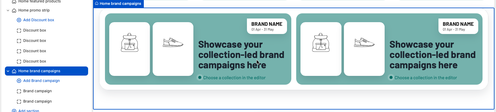
The Home brand campaigns section highlights collection-led campaigns with editorial product imagery and
short campaign copy. Use it for brand edits, seasonal drops, collaborations, gift guides, or any collection
that benefits from a stronger visual story than a standard product row.
Campaign cards use a horizontal layout with two product images, a brand badge, campaign text, and a
highlight label. On wide screens, the section displays two campaign cards in one row.
Home brand campaigns settings
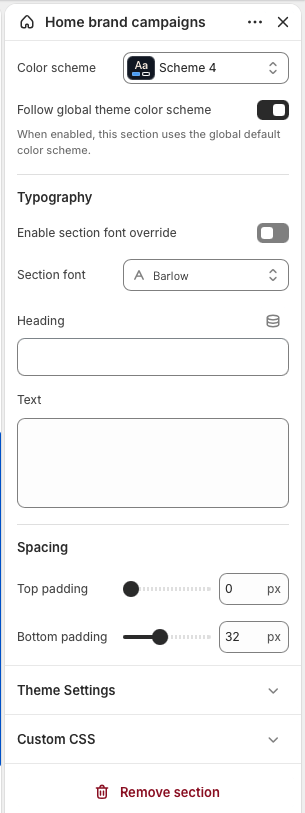
Section style
Use Color scheme to style the campaign frame and cards. Keep
Follow global theme color scheme enabled when this section should inherit the
storewide default color scheme.
Typography
The section inherits homepage typography by default. Enable
Section font override and choose a Section font only when the
campaign heading, badges, and card copy need a distinct type style.
Header content
Set Heading for the section title and use Text for a short
explanation above the campaign cards. If both fields are blank, the header area is hidden and only
the campaign cards are shown.
Spacing
Adjust Top padding and Bottom padding to control the distance
between this campaign frame and surrounding homepage sections.
Section settings control the global campaign frame, heading content, typography, color scheme, and
spacing.
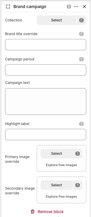
Brand campaign blocks
Collection
Choose the Collection that the card should feature. This field is required for a
real campaign card; blocks without a collection are skipped, and each card links automatically to
the selected collection.
Campaign label
Use Brand title override when the card should show a shorter or more editorial
brand name than the collection title. Add Campaign period for date ranges,
launch windows, or limited-time campaign messaging.
Campaign copy
Use Campaign text for the main message inside the card. Add a
Highlight label for a short supporting note, such as Choose a collection,
Limited edition, Online exclusive, or Shop the edit.
Image overrides
Add Primary image override and Secondary image override when
the campaign needs custom editorial imagery. If they are blank, the section uses product images
from the selected collection, then falls back to the collection image when needed.
Block order
Add, remove, and reorder Brand campaign blocks to control which campaigns appear
first. The section supports up to eight campaign blocks.
Each Brand campaign block controls one campaign card and links the entire card to the selected
collection.
Set up the section
Add Home brand campaigns to the Home page template.
Add one Brand campaign block for each collection-led campaign.
Select a collection in each block so the campaign card has a destination and product image fallbacks.
Add optional title, period, campaign text, highlight label, and image overrides to shape the editorial
message.
Reorder the blocks so the most important brand or collection campaign appears first.
Best practice: Use collections with strong product imagery and keep campaign text concise.
Two campaign cards make a balanced desktop row, while additional blocks create a deeper campaign grid.