Assign the template
In Shopify admin, create or open an About page and assign the about theme template. Add the long-form brand story in the page content area when the section setting Show page content should display it beneath the intro text.
Static pages can be prepared with rich text content and flexible section composition, so merchants can build store policies, brand pages, guides, and other reusable page layouts.
Page template
The About page uses the page.about template and the About story section. It is designed for brand storytelling: a hero introduction, supporting page content, value cards, a milestone timeline, a founder-style quote, and a final call to action. Merchants can edit the page copy in Shopify admin and fine-tune the full storefront layout from the theme editor.
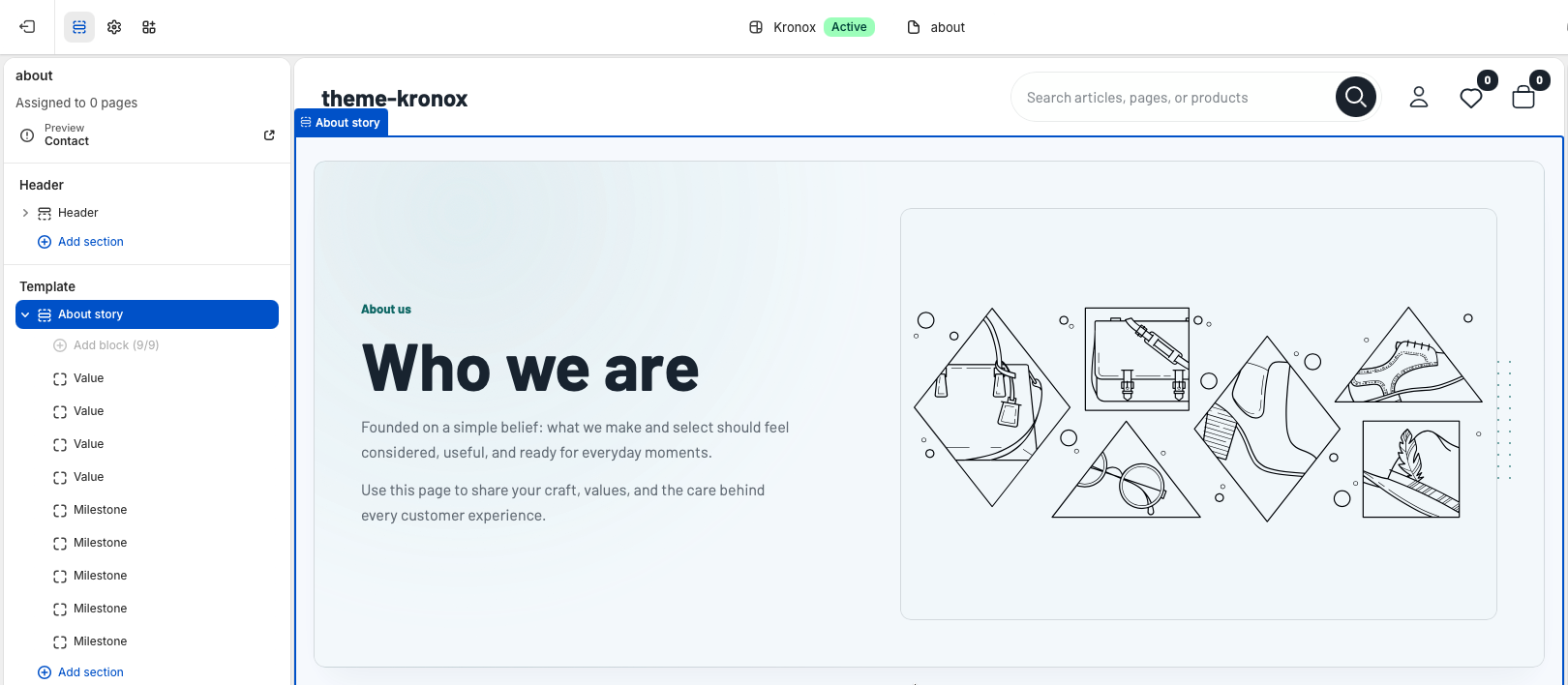
The default page.about.json template contains a single About story section with four Value blocks and five Milestone blocks. The blocks can be reordered, edited, or removed in the theme editor. The section also supports fallback theme text, so the page still previews cleanly before a merchant finishes every field.
In Shopify admin, create or open an About page and assign the about theme template. Add the long-form brand story in the page content area when the section setting Show page content should display it beneath the intro text.
Select About story in the Template area. Use the global color scheme option when the page should inherit the storewide palette, or choose a dedicated color scheme for a more editorial brand page.
Use Content max width to control how wide the page can stretch on large screens. The default is 1640px, which gives the hero and timeline enough room without making text lines too long.
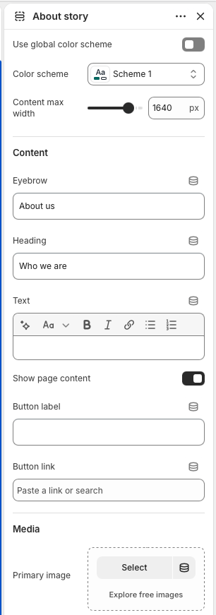
Set the Eyebrow, Heading, and rich text Text fields to introduce the brand. Leave the heading blank only when the page title should act as the main heading.
Enable Show page content to display the Shopify page body inside the hero area. This is useful when merchants prefer editing long narrative copy from the Pages admin instead of inside section settings.
Add a Button label and Button link when the intro should lead customers to collections, featured products, a journal page, or a contact page. The button is hidden until both fields are filled.
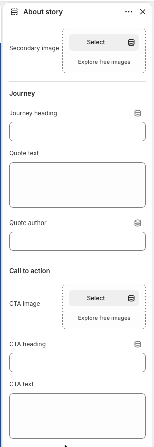
Add a Primary image for the hero media and a Secondary image for the journey area. Use images with clear subjects and similar visual tone so the page feels intentional across desktop and mobile layouts.
Set the Journey heading, Quote text, and Quote author to connect the timeline with a human brand voice. If these fields are blank, localized default copy is used.
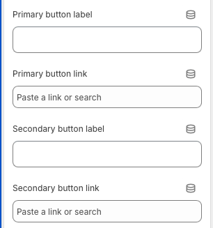
Use the CTA image, heading, text, and up to two buttons to send customers to the next step after they read the brand story. Common destinations are a collection list, a featured collection, or the contact page.
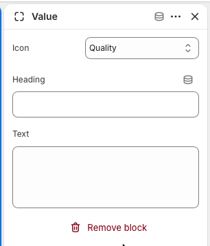
Value blocks create the compact cards below the hero. Use them for brand promises such as quality, responsible materials, delivery, design, service, or warranty. The section supports up to four Value blocks, each with an icon, heading, and short text.
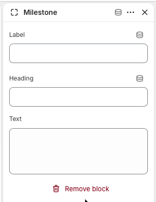
Milestone blocks build the timeline in the journey area. Use them for founding moments, product launches, global expansion, sustainability changes, store openings, community initiatives, or other proof points that help customers understand the brand's progression.
Page template
The storefront Contact page uses the page.contact template. This is different from the documentation support form linked in the header. The storefront template is built for customer contact, store details, and social channels inside Shopify, while the documentation contact form is only for public Kronox theme support.
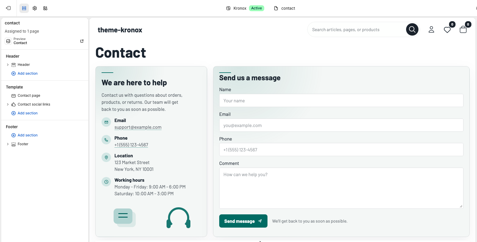
The default page.contact.json template contains two sections. The first section, Contact page, renders the page heading, optional page body, Shopify contact form, and contact details sidebar. The second section, Contact social links, renders brand social links from Shopify brand settings and optional manual social network blocks.
In Shopify admin, create or open the customer-facing Contact page and assign the contact theme template. Add any intro copy in the page content field when the page should show a short note above the form and contact details.
Use Follow global theme color scheme when the page should inherit storewide colors. Disable it and choose Color scheme when the contact area needs its own background and surface treatment.
Use Content max width to control the full page width. Adjust top and bottom padding to place the form comfortably between the header, social links, and footer.
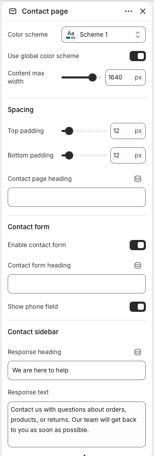
Set Contact page heading when the storefront heading should be different from the Shopify page title. If the Shopify page has body content, the section displays it under the heading as introductory copy.
Keep Enable contact form turned on when customers should be able to send a message through Shopify's built-in contact form. The form includes name, required email, optional phone, and required message fields.
Use Show phone field when phone follow-up is useful for the store. Disable it for simpler support workflows where email-only contact is preferred.
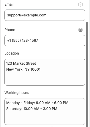
The sidebar is shown when at least one contact detail is filled in. Use Response heading and Response text to set expectations, then add email, phone, location, and working hours as needed. Email and phone values become clickable links on the storefront, while location and working hours support multiple lines.
The Contact social links section helps customers continue the conversation on social channels. It can pull links from Shopify brand settings, render manual social network blocks, or combine both. Social cards are rendered with the contact-social-card snippet, which shows the platform icon, label, optional handle, and a link arrow.
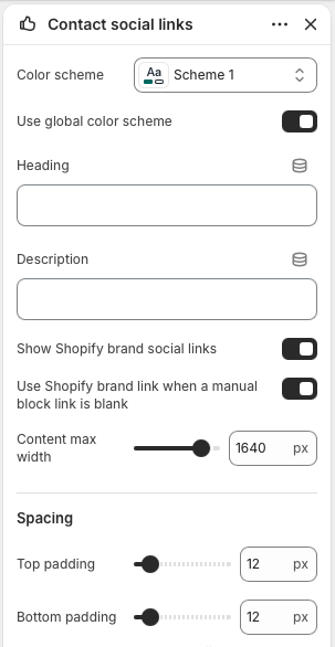
Enable Show Shopify brand social links to use social URLs configured in Shopify brand settings. The section supports common platforms including Instagram, Facebook, X, LinkedIn, Pinterest, TikTok, YouTube, Snapchat, Tumblr, and Vimeo.
Add Social network blocks for page-specific channels or custom labels. Each block has a platform, label, handle, link, and Open in new tab option.
Enable Use Shopify brand link when a manual block link is blank when manual blocks should inherit the matching brand social URL. This is helpful when merchants want custom labels or handles without re-entering every link.
Page template
The FAQ page uses the page.faq template and one main FAQ section. It is built for customer self-service: a clear help-center hero, category buttons, filtered question accordions, and an optional support card for customers who still need help.
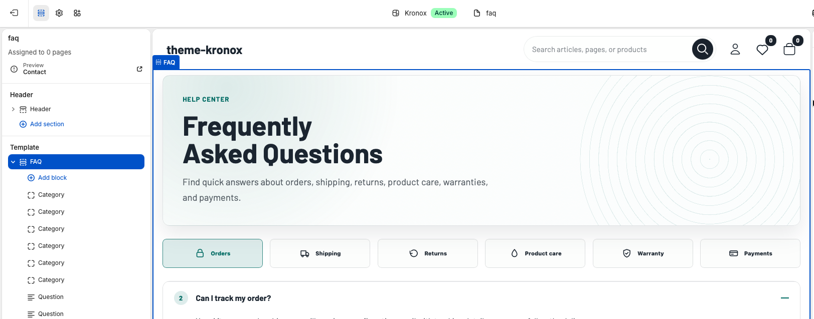
The default page.faq.json template includes six Category blocks and seven Question blocks. Category blocks create the filter buttons across the page, while Question blocks create the accordion items. Each question is connected to a category by its Category setting, so customers can filter answers by topic.
In Shopify admin, create or open the FAQ page and assign the faq theme template. Use the Shopify page body only when the FAQ section setting should pull page content into the hero.
Keep Follow global theme color scheme enabled when the FAQ page should inherit the storewide palette. Use Color scheme, Content max width, and Corner radius to tune the full FAQ layout.
Adjust top and bottom padding when the FAQ page needs more room below the header or above the footer. Keep spacing moderate so customers can reach the questions quickly.
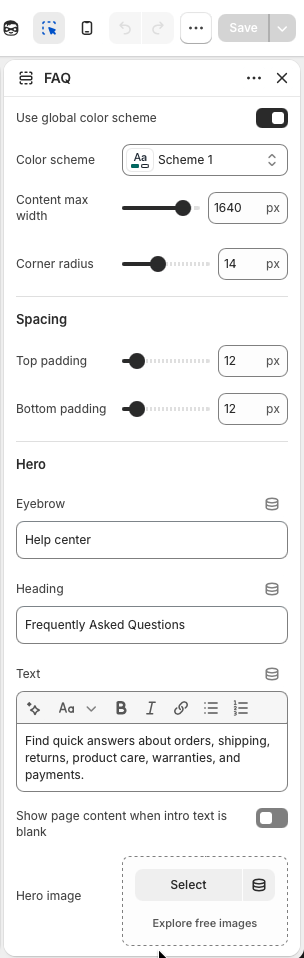
Use Eyebrow, Heading, and rich text Text to introduce the page. If the Text field is blank, enabling Show page content when intro text is blank lets the section display the Shopify page body instead.
Add a Hero image when the FAQ page needs a warmer service or product-care visual. If no image is selected, the hero remains text-first and the page still works cleanly.
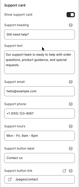
Enable Show support card to display help copy, email, phone, hours, and a CTA button below the FAQ list. This is useful when customers may need order-specific support.
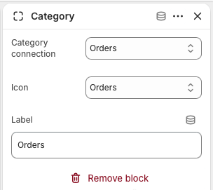
Category blocks create the filter buttons customers use to switch between FAQ topics. The section supports up to eight categories, including Orders, Shipping, Returns, Product care, Warranty, Payments, Custom 1, and Custom 2. A category only becomes useful when one or more Question blocks use the same category connection.
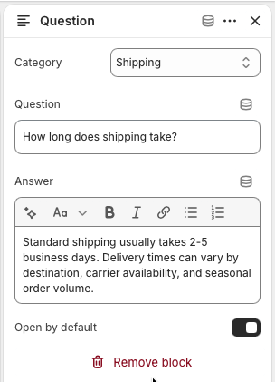
Question blocks create the accordion rows inside the FAQ list. Each block has a category, question, rich text answer, and an Open by default option. When customers choose a category, the section hides questions from other categories and opens the first visible item.
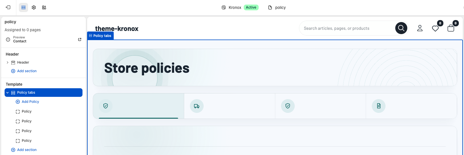
The policy page uses the page.policy template and the Policy tabs section. It gives merchants a single, scannable place for returns, shipping, privacy, terms, warranty, and other policy content without hardcoding store-specific text.
Page template
In Shopify admin, create a page for store policies and assign the policy theme template. The template is section-based, so merchants can keep the page flexible while the Policy tabs section handles the structured policy layout.
Add broad introductory copy in the Shopify page content area when the section setting Show page content when intro text is blank is enabled. This keeps longer policy introductions editable from the Pages admin.
The default template includes Returns, Shipping, Privacy, and Terms blocks. Merchants can edit, remove, duplicate, or reorder these blocks from the theme editor.
Policy tabs section
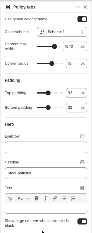
Select Policy tabs in the Template area to control the page wrapper, hero content, spacing, and support area. These settings affect every policy tab on the page.
Enable Use global color scheme when the policy page should inherit the storewide palette. Disable it to choose a dedicated color scheme. Use Content max width to control the maximum layout width on large screens.
Corner radius, Top padding, and Bottom padding tune the page rhythm. The defaults create a roomy documentation style that still works on mobile.
Set the Eyebrow, Heading, and rich text Text fields for the top introduction. If the section heading is blank, the page title is used as the main heading.
Policy blocks
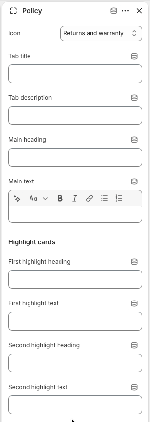
Each Policy block becomes one tab and one matching content panel. The section supports up to eight policy blocks, which is enough for common store policies without making the tab bar hard to scan.
Choose an Icon for the tab, then set the Tab title and Tab description. Available icon styles include returns, shipping, privacy, terms, and lock.
Use Main heading and Main text for the policy overview. Keep the first paragraph short so customers can understand the policy before reading the detailed cards.
Add two highlight cards for the most important requirements, such as return windows, packaging rules, shipping timelines, data usage, or warranty exclusions.
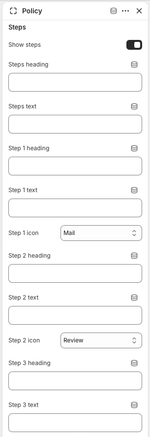
Enable Show steps to display a four-step process. Each step has a heading, text, and icon. Use this area for workflows like request, review, approval, and resolution.
Step icon choices are Mail, Review, Check, and Refund. Pick icons that match the customer action, not just the policy category, so the process is easier to scan.
Blank step headings or text are skipped. This lets merchants use fewer than four visible steps when a policy needs a simpler flow.
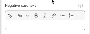
Enable Show comparison cards to show a positive and negative card. This pattern works well for included versus not included, eligible versus not eligible, or available versus restricted details.
Use the positive and negative rich text fields for short bullet lists. Keep each bullet specific so customers do not need to contact support for basic eligibility questions.
Use direct headings such as Included, Not included, Eligible, Not eligible, Covered, or Excluded. The comparison card styling handles the visual distinction.
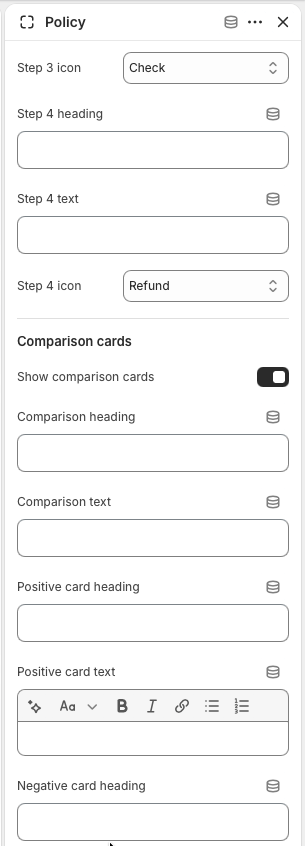
The final rich text field completes the negative comparison card. Use concise bullets for exclusions, restricted cases, or policy limits.
Support card
The optional support card appears below the policy panels. Use it for direct help channels when customers still need a human answer after reading the policies.
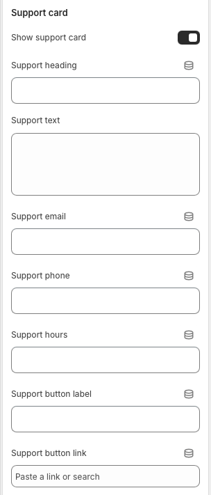
Toggle Show support card on when the policy page should include a final contact area. Turn it off for stores that route all service requests through a separate contact page.
Add support email, phone, and hours. Email and phone render as customer-friendly links, while support hours appear as plain text.
Add a Support button label and Support button link to send customers to a contact page, help center, returns portal, or order lookup page.
Best practices
Put the most important promise or limitation in the tab description, then use the panel for details. Customers should understand the policy shape before opening every card.
Avoid campaign-specific copy in this page. Use it for long-lived operational information such as returns, shipping, privacy, service terms, warranties, repairs, subscriptions, or store pickup.
On small screens, the tab list becomes horizontally scrollable and each active panel stacks into a single column. Review long tab titles and comparison lists on mobile before publishing.