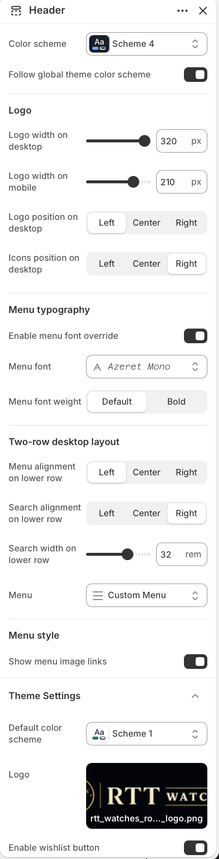
Color scheme
Choose the color scheme used by the header area.
Use Color scheme when the header needs its own palette. Keep Follow global theme color scheme enabled to use the default theme colors instead.
The header controls the storefront logo, navigation, account and cart icons, localization selector, wishlist button, and predictive search field.

Choose the color scheme used by the header area.
Use Color scheme when the header needs its own palette. Keep Follow global theme color scheme enabled to use the default theme colors instead.
Control logo size and desktop placement.
Adjust Logo width on desktop and Logo width on mobile to fit the uploaded brand mark. Use Logo position on desktop and Icons position on desktop to place the brand and utility icons on the top row.
Control the navigation font and weight.
Turn on Enable menu font override only when the navigation should use a different font from the rest of the theme. Select Menu font and use Menu font weight to switch between default and bold labels.
Set the lower row alignment for menu and search.
Menu alignment on lower row and Search alignment on lower row support left, center, or right alignment. Use Search width on lower row to balance search visibility with available navigation space.
Select the Shopify menu shown in the header.
Choose the navigation menu from Menu. Keep menu labels short so the two-row header stays readable on desktop and collapses cleanly on smaller screens.
Enable optional image links in dropdown menus.
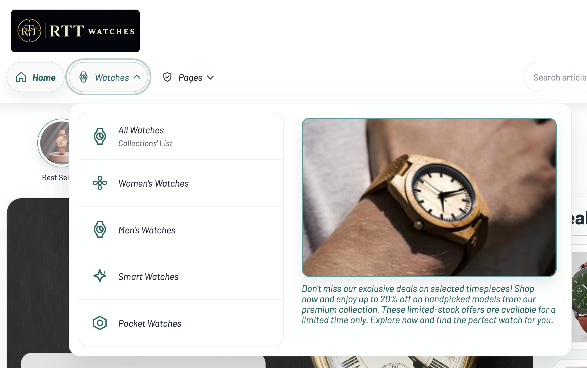
Turn on Show menu image links to display matching Menu image link blocks beside dropdown menu items. This works best for visual category shortcuts or featured links.
Add an icon to a top-level or submenu item.
Add a Menu item icon block, enter the exact Menu item title, then choose an Icon or upload a Custom icon image. Custom images override the selected icon.
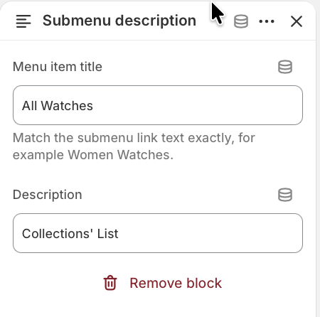
Add helper text under submenu links.
Add a Submenu description block, match the submenu label in Menu item title, then add the short Description shown below that submenu item.
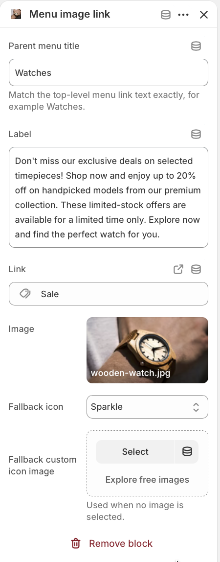
Add visual links beside a parent dropdown.
Add a Menu image link block and match the top-level dropdown label in Parent menu title. Set the Label, Link, and Image. If no image is selected, the fallback icon or fallback custom icon image is used.
Adjust global header-related defaults used by the theme.
Use Default color scheme to choose the fallback scheme used across the theme when a section follows global theme colors. Upload or select a Logo for the storefront brand mark, and use Enable wishlist button to show or hide wishlist actions.