Color scheme
Use Color scheme only when this collection header needs a dedicated palette. Keep Follow global theme color scheme enabled to inherit the storewide default colors from theme settings.
Collection pages are structured with grid layouts, sorting, filtering, and pagination to support large catalogs. Shopify Search & Discovery filters can be used for product type, vendor, price, variant options, and metafields.
Collection header
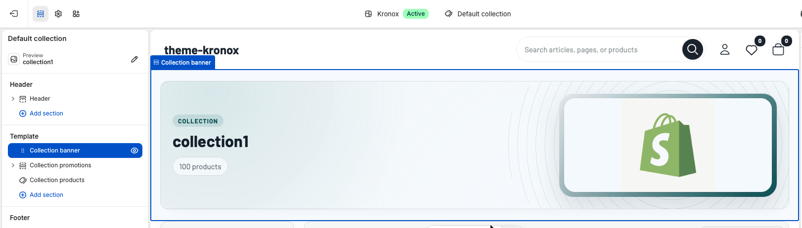
The Collection banner section introduces the active collection with a title, optional description, product count, and image. By default it uses the collection title, description, and featured image from Shopify admin. Merchants can override those fields from the theme editor when a collection needs campaign-specific copy or artwork.
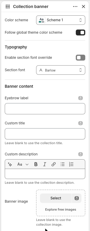
Use Color scheme only when this collection header needs a dedicated palette. Keep Follow global theme color scheme enabled to inherit the storewide default colors from theme settings.
Enable section font override when the banner should use a different font from the global primary font. The Liquid renders the selected font face and passes font variables into the banner, so the heading, eyebrow, count pill, and description stay visually consistent.
Eyebrow label defaults to the collection label translation when left blank. Custom title, Custom description, and Banner image are optional overrides. Leave them empty to use the collection title, collection description, and collection featured image.
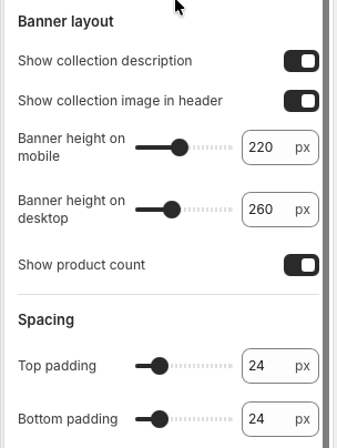
Enable Show collection description to display the collection description or the custom rich text override. Enable Show collection image in header to add the image column. If no image is available, the Liquid automatically keeps the banner as a copy-only header.
Banner height on mobile and Banner height on desktop control
the minimum header height through CSS variables. Show product count displays the
live collection.products_count value, which is useful for large catalogs and filtered
category browsing.
Adjust Top padding and Bottom padding to control the distance between the banner and neighboring template sections. The default 24px spacing keeps the banner visually connected to the product grid without crowding the page.
Merchandising
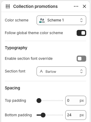
Collection promotions is an optional section for campaign tiles above the product grid. The section renders only when blocks exist, which keeps empty collection templates clean. Use it for seasonal messages, shipping offers, sale callouts, or links to related collections.
Color scheme and Follow global theme color scheme work the same way as the banner. Use the global scheme for a quiet product-listing page, or choose a specific scheme when promotional content needs stronger contrast.
The font override applies to the promotion tile text and button. Top padding and Bottom padding control how tightly the tile row sits between the banner and the collection products section.
Add up to three Promo tile blocks. Each block has an image, heading, text, button label, button link, and overlay accent color. The section also accepts app blocks, with a maximum of four total blocks.
Product listing
Collection products is the main catalog section. It paginates the current collection products, renders
Shopify filters from collection.filters, provides sorting from collection.sort_options,
and reuses the product showcase/card system for consistent product cards across the theme.
Enable filters to show Shopify Search & Discovery filter groups when the collection has filters available. Filter groups support checkbox values and price ranges, active filter counts, clear-all links, and a collapsible mobile panel. Enable sorting to show the collection sort dropdown.
Products per page controls the Liquid paginate size. Choose Numbered pages, Load more button, or Infinite scroll. Desktop columns can be set from 2 to 5, while mobile supports 1 or 2 columns.
Show vendor displays product vendor names when brand comparison matters. Show second image on hover adds alternate product imagery. Enable quick add and Enable quick buy expose faster purchase paths from the grid when products support them.
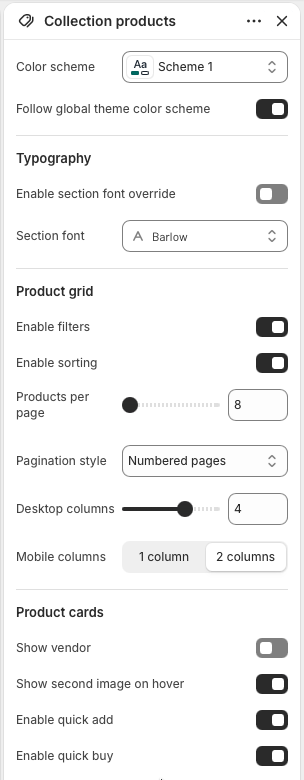
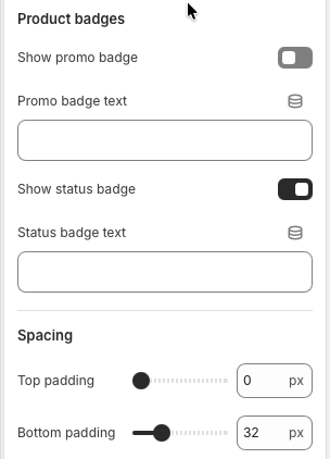
Enable Show promo badge and enter Promo badge text for campaign labels such as sale, bundle, or limited-time messaging. Show status badge uses the configured Status badge text, which defaults to "In stock".
When a collection or filtered result has no products, the section displays the translated empty state text and a clear-all link back to the collection URL. This prevents dead-end collection pages after customers apply restrictive filters.
Product section padding controls the vertical rhythm around the toolbar, filter sidebar, product grid, and pagination. The default bottom padding gives numbered pagination or load-more controls room before the footer.