Color scheme
Keep Follow global theme color scheme enabled when the search page should inherit the storewide default palette. Choose a specific Color scheme only when search needs a dedicated visual treatment.
The search template gives customers a dedicated place to browse matching products, pages, and blog articles. It includes result summary messaging, product cards, optional filters and sorting, editorial result cards, pagination, and clear empty or ready states.
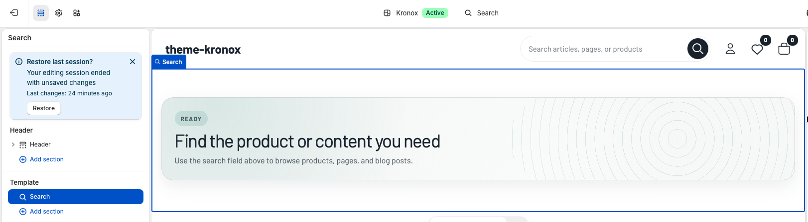
Template section
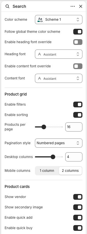
The Search section controls the page style, product grid density, result controls, and product card actions. It is designed for stores with small or large catalogs because the same section can show a compact product grid, a filter sidebar, sorting, and progressive pagination.
Keep Follow global theme color scheme enabled when the search page should inherit the storewide default palette. Choose a specific Color scheme only when search needs a dedicated visual treatment.
Use Enable heading font override for result headings and status cards. Use Enable content font override for body copy, controls, filters, and card text. Leave both disabled to keep search aligned with global theme typography.
Enable filters displays Shopify search filters when they are available. Enable sorting adds the search sort selector. Products per page controls pagination size, while Desktop columns and Mobile columns set the product card grid density.
Choose Numbered pages for predictable navigation, Load more button for customer-controlled browsing, or Infinite scroll for a continuous discovery experience.
Show vendor and Show secondary image control card details. Enable quick add and Enable quick buy let customers move from search results to purchase faster when the product card supports those actions.
Customer experience
When a customer performs a search, the section shows a status banner with the result count and search term. Product results are rendered first in the product grid. Article and page results are displayed below as editorial cards with type labels, images when available, excerpts, and article publish details.
If no search has been performed, the page shows a ready state that asks customers to use the search field. This keeps the template useful even when someone lands on the search page directly.
If Shopify returns zero matches, the section displays an empty state with the searched term and a zero result count. The copy is translated through locale strings, so it can be localized with the rest of the theme.
Filters are read from search.filters and submitted through a semantic form. Configure
product type, vendor, price, option, and metafield filters in Shopify Search & Discovery. The
theme preserves the active search term and result type while filters or sorting are applied.
Load more and infinite scroll fetch the next results page, append product and editorial cards, and refresh product card behaviors such as quick actions and image sliders. Status text uses live regions so assistive technology receives loading feedback.
Quality check
Confirm Shopify Search & Discovery filters are configured, then test product type, vendor, price, variant option, and metafield filters from the search results page.
Test queries that return products, pages, and articles. Product cards should remain in the grid, and editorial results should appear as separate article or page cards.
Check one-column and two-column mobile grid settings, filter panel behavior, sort controls, and pagination on mobile and desktop.
Visit the search page before submitting a query and test a query with no matches. Both states should show clear translated messaging and should not leave an empty product grid on the page.