Color scheme
Keep Follow theme default color scheme enabled when the collection index should inherit global theme colors. Choose Color scheme only when the list page needs a different palette from the rest of the storefront.
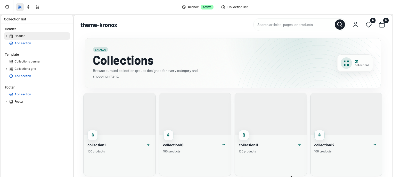
The Collection list template is the storewide collection index. It combines a Collections banner section with the Collections grid section, which paginates Shopify collections and renders reusable collection cards.
collections object. It does
not require merchants to select every collection manually, and it includes app block support for extensions
that need to appear above the collection cards.
Collection list header
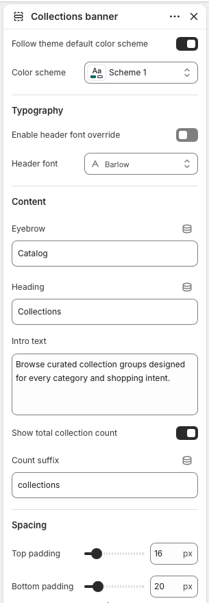
The Collections banner introduces the index page with an eyebrow, heading, intro text, and optional total collection count. If the heading is left blank, the section falls back to the translated collections title. The count badge uses the current number of collections available to the template.
Keep Follow theme default color scheme enabled when the collection index should inherit global theme colors. Choose Color scheme only when the list page needs a different palette from the rest of the storefront.
Enable header font override when the banner needs a different display font. The selected font is applied to the banner container, including the title, eyebrow, intro, and count badge.
Use Eyebrow, Heading, and Intro text to set the page context. Enable Show total collection count to display the count badge, then edit Count suffix when the store needs different wording.
Top padding and Bottom padding control the banner's vertical rhythm. The default spacing keeps the header close to the grid while still separating it from the storefront header.
Collection cards
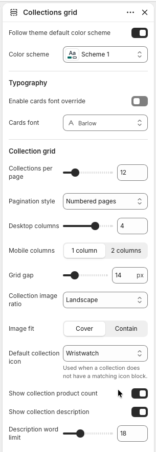
The Collections grid section paginates all published collections and renders each one as a linked card. Cards use the collection featured image when available, a Shopify placeholder when missing, the collection title, optional product count, and optional truncated description.
The grid can inherit the global color scheme or use a specific scheme. Enable cards font override only when collection cards should use a different font from the main theme typography.
Collections per page controls the Liquid paginate size. Choose numbered pages for predictable navigation, a load-more button for progressive browsing, or infinite scroll for a more continuous collection discovery flow.
Set Desktop columns from 2 to 5 and Mobile columns to 1 or 2. Use Grid gap to tighten or loosen the card spacing across the index.
Choose landscape, square, or portrait for Collection image ratio, then use Image fit to decide whether images crop or contain. The Default collection icon appears on any card without a matching Collection icon block.
Enable Show collection product count for catalog-size context. Enable Show collection description to display a plain-text excerpt, then use Description word limit to keep card heights consistent.
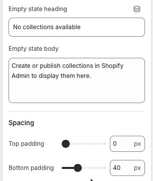
Empty state heading and Empty state body appear when there are no collections available to render. Keep the message action-oriented so merchants understand they need to create or publish collections in Shopify Admin.
Top padding and Bottom padding apply around the grid content, app blocks, empty state, and pagination. The default bottom padding gives pagination controls room before the footer.
Grid blocks
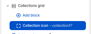
Collection icon blocks let merchants assign a specific icon to a specific collection card. During rendering, the section loops through blocks and matches the selected block collection handle to the current card's collection handle. When no matching block exists, the card uses the section's default collection icon.
Open Collections grid and choose Add block, then add a Collection icon block. Blocks can be reordered in the editor, but the storefront match is based on the selected collection, not the block position.
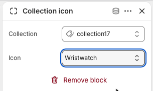
Select the target Collection, then choose an Icon. Available options are wristwatch, tag, percent, men, women, stack, clock, and grid. Use icon blocks for important collections that need a clearer visual signal than the default icon.
aria-hidden="true".