Global settings
The logo, color system, type scale, and spacing rules apply across the full storefront experience.
Theme settings are designed around merchant workflows. Global branding, colors, typography, layout widths, header behavior, and footer content can be updated from the theme editor.
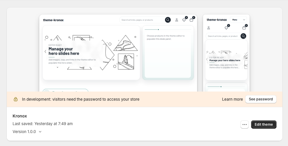
The logo, color system, type scale, and spacing rules apply across the full storefront experience.
Homepage, product, collection, blog, and static page content is managed with drag-and-drop sections and blocks.
Metafields and Shopify dynamic sources are supported; avoid hardcoded products or collections.
Global configuration
Use the gear icon in the Shopify theme editor to open Theme settings. These settings control storefront-wide defaults, so changes made here can affect multiple templates and sections at once. Individual sections may still offer their own settings when a more specific override is needed.
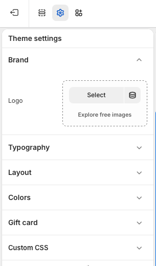
Add the store logo from Theme settings > Brand. Select an uploaded image or choose an image from Shopify's free image library. The logo is used in global brand areas such as the header and other theme surfaces that reference the store identity.
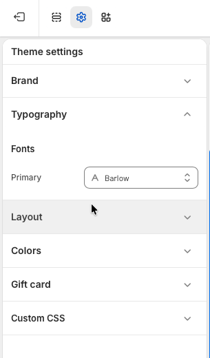
Set the primary storefront font from Theme settings > Typography. This font is the default typeface for the theme and helps keep headings, body text, buttons, and form controls visually consistent across the store.
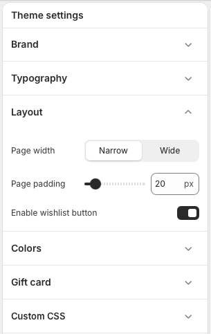
Adjust storefront spacing from Theme settings > Layout. Choose a narrow or wide page width, set the page padding in pixels, and enable or disable the wishlist button. Use a wider layout for image-rich stores or large catalogs, and use narrower spacing when readability is the main priority.
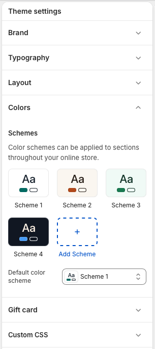
Manage the theme color system from Theme settings > Colors. Edit existing color schemes, add new schemes, and choose the default color scheme for the store. Color schemes can be applied to sections throughout the theme, making it easier to create contrast between promotional, editorial, and product-focused areas without rebuilding section layouts.
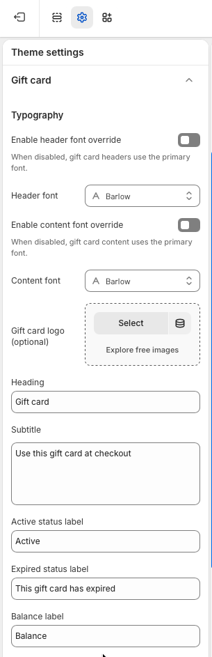
Customize the gift card experience from Theme settings > Gift card. You can keep the global primary font or enable separate header and content font overrides, add an optional gift card logo, and edit the heading, subtitle, status labels, balance label, and other customer-facing text.
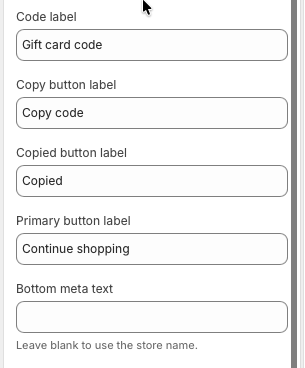
The lower gift card settings control the gift card code label, copy button text, copied confirmation, primary button label, and bottom meta text. Leave the bottom meta text blank if the gift card should automatically use the store name.
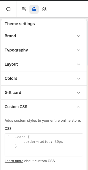
Add small global style adjustments from Theme settings > Custom CSS. Custom CSS is applied to the entire online store, so keep changes focused and test key pages after editing. For larger design changes, update the theme settings or relevant section settings first whenever possible.