Color scheme
Keep Follow global theme color scheme enabled when the cart should inherit the storewide default colors. Choose a specific Color scheme only when the cart page needs a dedicated campaign or checkout palette.
The cart template combines a clear order review banner, editable cart line items, an order summary, discount code controls, accelerated checkout buttons, and optional product recommendations. It is built from three reusable OS 2.0 sections: Cart banner, Cart, and Cart recommendations.
Cart header
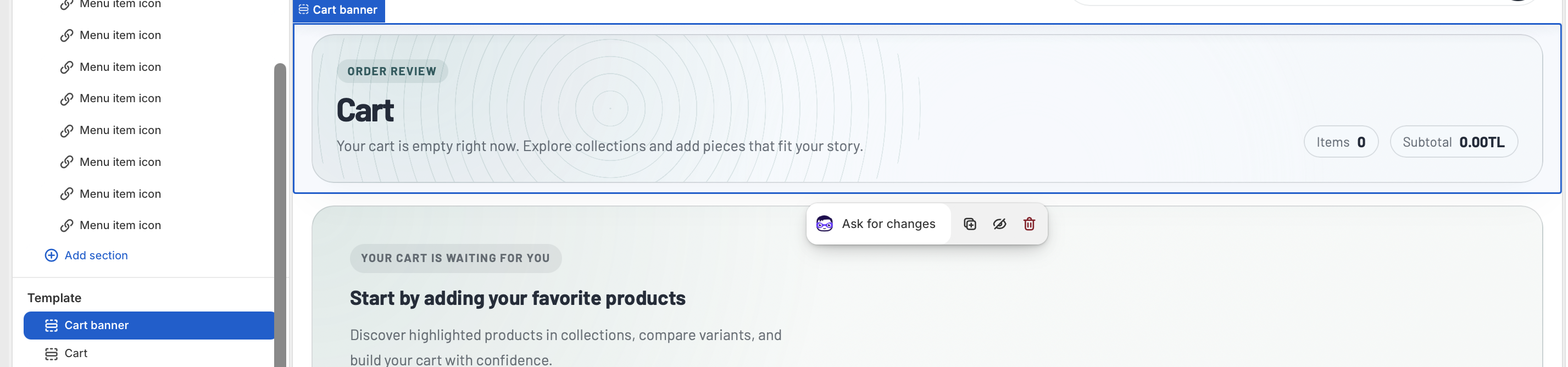
The Cart banner section introduces the cart page and gives customers a quick summary before they edit their order. It displays the translated cart title, item count, subtotal, total savings when discounts are active, and short copy that changes between filled and empty cart states.
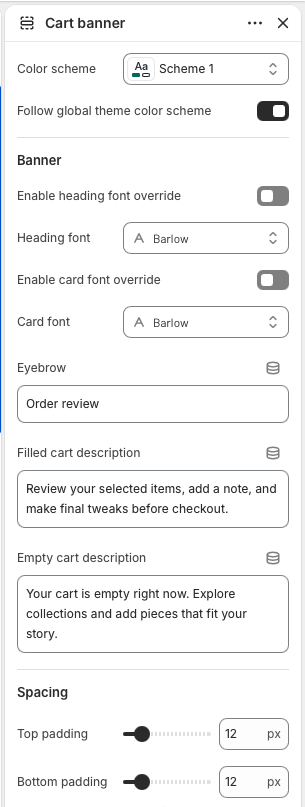
Keep Follow global theme color scheme enabled when the cart should inherit the storewide default colors. Choose a specific Color scheme only when the cart page needs a dedicated campaign or checkout palette.
Use Enable heading font override only when the cart banner needs a dedicated heading font. Leave it disabled to keep the cart aligned with the global theme typography.
Eyebrow appears above the cart title. Filled cart description is shown when the cart has items, while Empty cart description is shown when the cart has no items. Keep both descriptions short because the banner also includes live summary pills.
Top padding and Bottom padding control the vertical rhythm around the banner. The default 12px spacing keeps the banner visually close to the cart controls.
Cart controls
The Cart section is the functional center of the template. It renders each line item, product image, variant details, selling plan details, custom line item properties, quantity controls, remove links, cart notes, discount code controls, subtotal rows, checkout, dynamic checkout buttons, and the empty cart state.
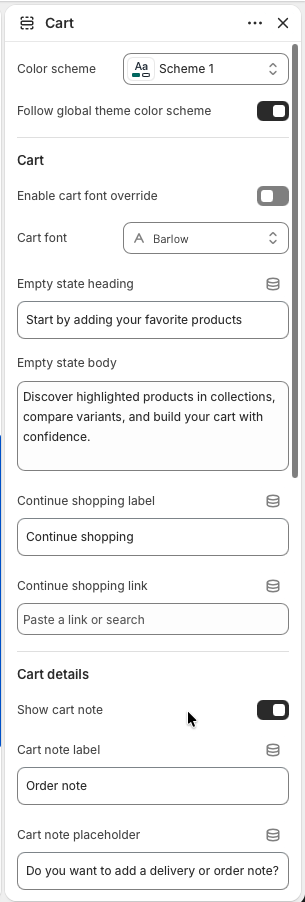
Empty state heading and Empty state body are shown only when the cart has no items. Use them to guide customers back into browsing rather than explaining the cart mechanics.
Continue shopping label controls the link text. If Continue shopping link is empty, the section falls back to the all products collection, so the link always has a safe destination.
Enable Show cart note when customers should leave delivery instructions, gift notes, or order comments. Cart note label and Cart note placeholder keep the field clear for the store's order workflow.
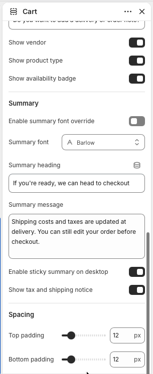
Show vendor, Show product type, and Show availability badge add small context pills to each cart item. Enable them for large catalogs where customers may compare brands, categories, or in-stock status.
Summary heading and Summary message appear above the checkout action. The summary automatically includes subtotal, line-item savings, cart-level discounts, total, discount code input, checkout, dynamic checkout buttons, and the optional tax and shipping notice.
Keep Enable sticky summary on desktop on for longer carts so checkout remains easy to reach while customers review line items. Disable it only if another app or custom layout needs the summary to scroll normally.
Show tax and shipping notice displays the translated Shopify tax message below checkout. Adjust section padding when the cart sits close to banner or recommendation sections.
Cart merchandising
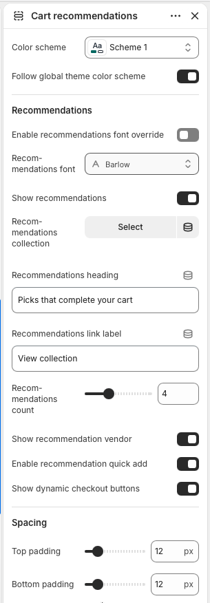
Cart recommendations adds a product grid below the cart. It can use a selected collection, or if no collection is selected, it falls back to the first collection found on a product currently in the cart. The section skips products already in the cart so recommendations stay useful.
Enable Show recommendations, then choose a Recommendations collection for curated add-ons. Leave the collection empty when the fallback collection from cart items should drive the recommendations automatically.
Recommendations heading labels the product grid, while Recommendations link label controls the link to the source collection. The collection title is also shown as a small eyebrow above the heading.
Set Recommendations count between two and eight products. Use Show recommendation vendor, Enable recommendation quick add, and Show dynamic checkout buttons to match the store's product card buying flow.
The section renders only when recommendations are enabled and a collection is available. If the selected or fallback collection has no eligible products, the storefront stays clean instead of showing an empty grid.
Before publishing