Color scheme
Use Color scheme when this product template needs a specific palette. Keep Follow global theme color scheme enabled when product pages should inherit the storewide default colors.
The product page is the main conversion template for the theme. It combines a large media gallery, variant selection, price and compare-at price messaging, quantity controls, add to cart, accelerated checkout, product description, detail tabs, breadcrumbs, support content, complementary products, and related products.
Product template
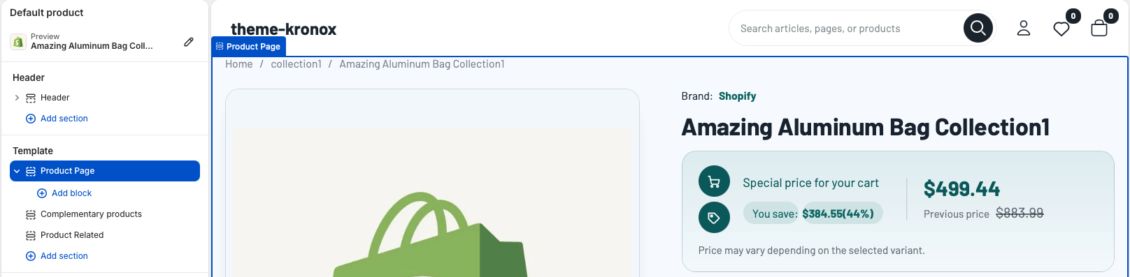
Open the Shopify theme editor and choose Default product from the page selector. The product template is built with the main Product Page section followed by product discovery sections such as Complementary products and Product Related. Merchants can reorder the discovery sections, while the Product Page section should stay at the top because it contains the purchase flow.
Product section
The Product Page section is powered by Shopify product data and does not require merchants to choose a specific product manually. It uses the currently viewed product, selected variant, product media, collections, tags, inventory, selling plans, and gift card settings.
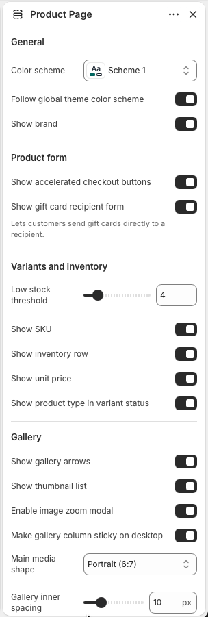
Use Color scheme when this product template needs a specific palette. Keep Follow global theme color scheme enabled when product pages should inherit the storewide default colors.
Enable Show brand when the vendor helps customers compare products or when brand recognition is important for the catalog. Disable it for stores where vendor names are internal labels.
Enable Show accelerated checkout buttons to display Shopify dynamic checkout buttons below the add-to-cart action when the selected variant can be purchased.
Enable Show gift card recipient form so gift card products can collect recipient details. This option appears only where Shopify's gift card product behavior applies.
Use Low stock threshold, Show SKU, Show inventory row, Show unit price, and Show product type in variant status to tune how much availability information is shown near the purchase form.
Product media
The gallery displays the product media assigned in Shopify admin. It supports multiple product images and media items, thumbnail navigation, previous and next arrows, variant-linked media changes, and an optional zoom modal for closer inspection.
Product content
Product information settings control the description area, details tab, variant metadata, tags, and typography. These options let merchants decide how much catalog data should appear on the product page without editing Liquid.
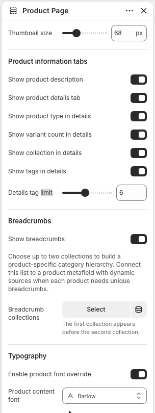
Enable Show product description when the product's Shopify description should appear in the product information tabs. Keep descriptions structured with short paragraphs, lists, and clear sizing or care notes.
Enable Show product details tab to show structured product metadata. The details tab can include product type, variant count, collection, and tags depending on the enabled settings.
Enable Show tags in details when tags are customer-friendly. Use Details tag limit to prevent long tag lists from overwhelming the details tab.
Enable Product font override only when product pages need a different type style from the global theme typography. Choose Product content font to control the product page heading, form, and supporting content typography.
Navigation
Breadcrumbs help customers understand where the product sits in the catalog. Enable Show breadcrumbs to display a path above the product layout. The section can use the current collection, the product's first collection, or up to two selected breadcrumb collections.
Product blocks
The Product Page section supports app blocks, custom Liquid, support cards, and custom accordions. Blocks are useful for product-specific services, delivery promises, care instructions, warranty notes, sizing guidance, or app-powered content.
Use Support card blocks for short reassurance points such as dispatch time, secure checkout, returns, or warranty coverage. The section supports up to four support cards.
Use Custom accordion blocks for expandable information. Each block can use rich text or pull content from a selected page, which keeps repeated policies easier to maintain.
Use app blocks for Shopify apps that need to appear in the product purchase flow. Use Custom liquid only for small trusted additions that cannot be handled by theme settings or app blocks.
Product recommendations
The default product template includes Complementary products and Product Related sections below the main Product Page section. Use these areas to help customers continue shopping after they understand the current product.
Product recommendations
The Complementary products section shows Shopify product recommendations with the complementary intent. It is best for accessories, add-ons, bundles, refills, matching pieces, or products that complete the item a customer is viewing.
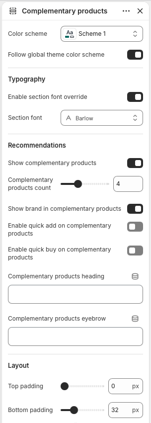
Use Color scheme to style this recommendation row. Keep Follow global theme color scheme enabled when complementary products should use the same palette as the rest of the product template.
Enable Section font override only when this row needs its own typography. Use Section font to match the recommendation heading and cards to a campaign or product family.
Enable Show complementary products, then set Complementary products count between two and eight products. The section uses Shopify's complementary recommendation data for the current product.
Enable Show brand in complementary products when vendor names help customers compare items. Use Enable quick add or Enable quick buy only when the recommended products are simple enough to buy from a card.
Set Complementary products heading and Complementary products eyebrow to explain why these items belong together. Short labels such as Pairs well with or Complete the set work best.
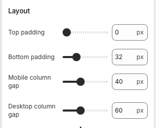
Adjust Top padding and Bottom padding to control how tightly the row sits below the main product section or nearby recommendation sections.
Product recommendations
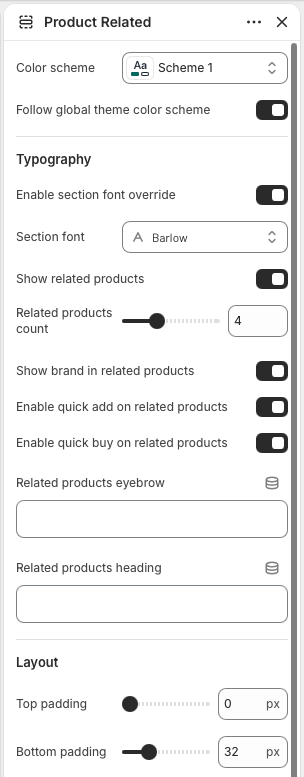
The Product Related section displays alternatives from the product's active or primary collection. It helps customers continue browsing similar items when the current product is not the perfect fit.
Use Color scheme for the related products row. Keep Follow global theme color scheme enabled when the row should match the product page's global color treatment.
Enable Section font override and choose a Section font only when the related products row needs a distinct text style from the main product page.
Enable Show related products and set Related products count between two and eight products. The section appears only when the current product has a collection with more products to show.
Enable Show brand in related products when brand names are useful in comparison. Enable quick add supports faster cart additions, while Enable quick buy is useful when direct checkout makes sense for the catalog.
Use Related products eyebrow for a small contextual label. Use Related products heading for the main row title, such as You may also like.
Adjust Top padding and Bottom padding to create enough separation from complementary products, reviews, or other product-template sections.